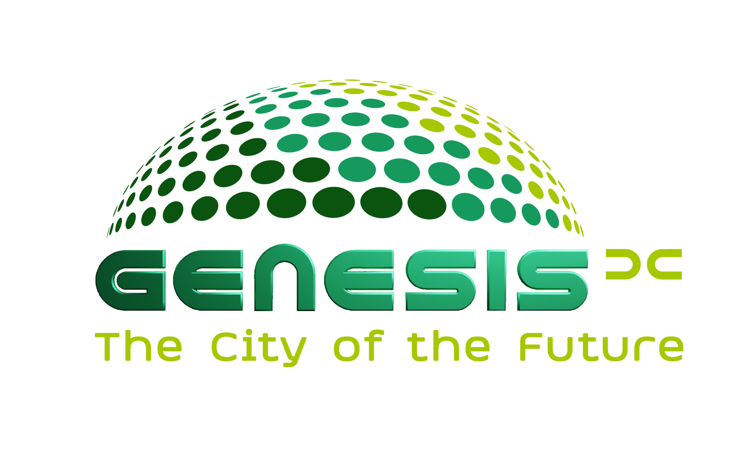
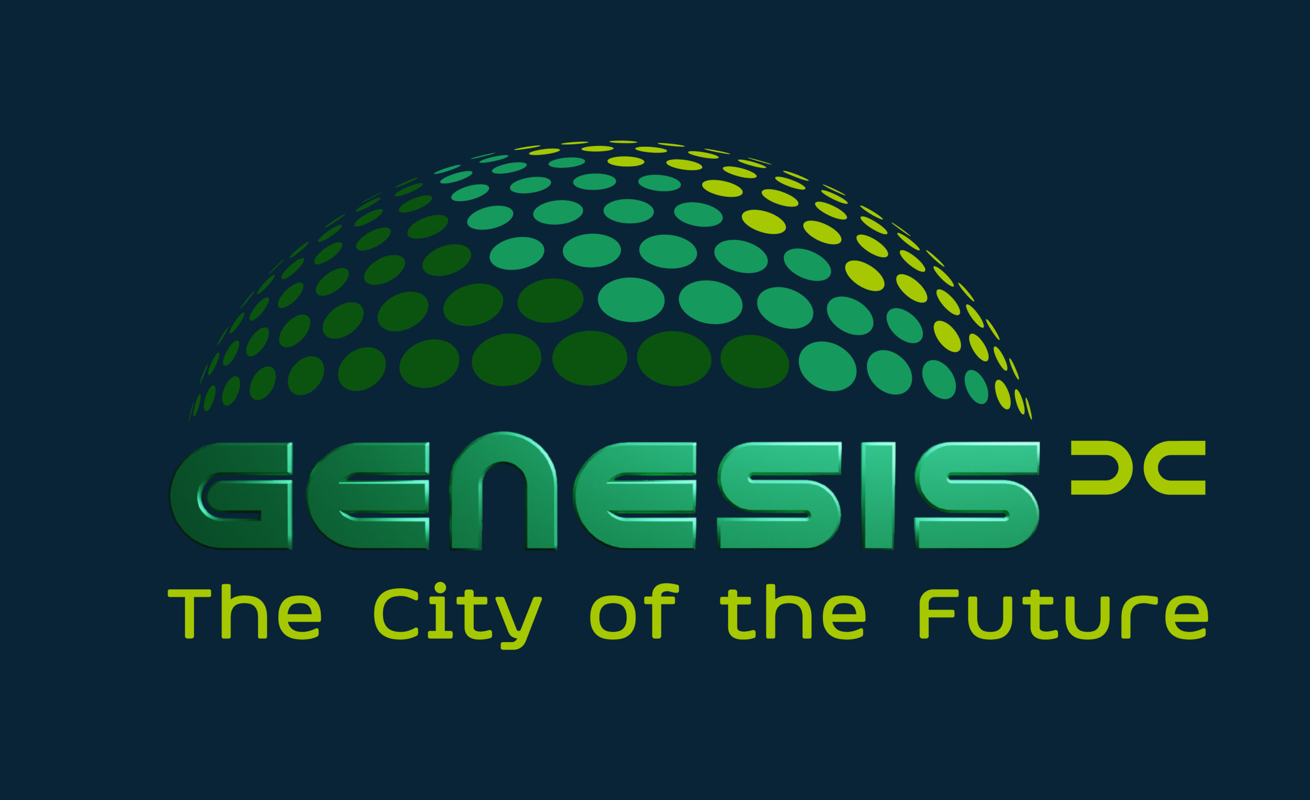
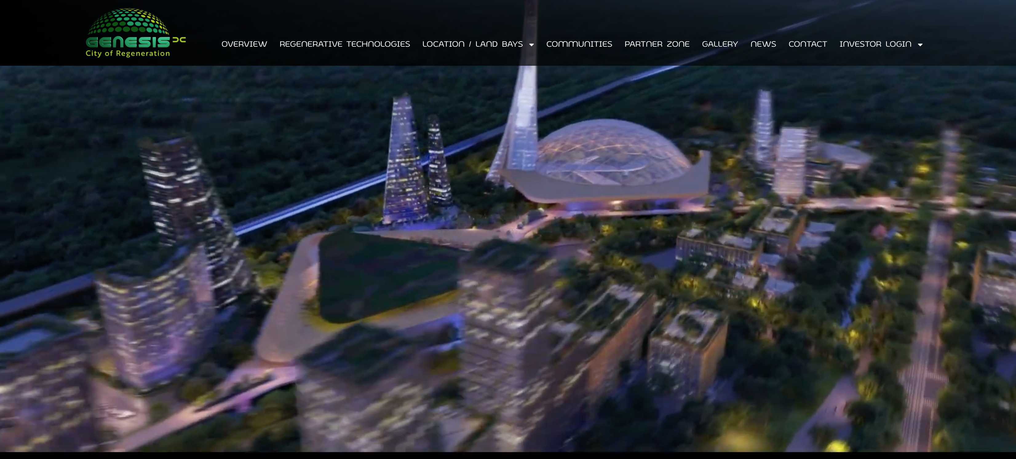
Genesis-DC is a planned, purpose-built city, located between Washington, DC and Richmond, VA, along the Interstate I-95. It is designed as a regenerative city (beyond sustainability) and leverages groundbreaking new green technologies.
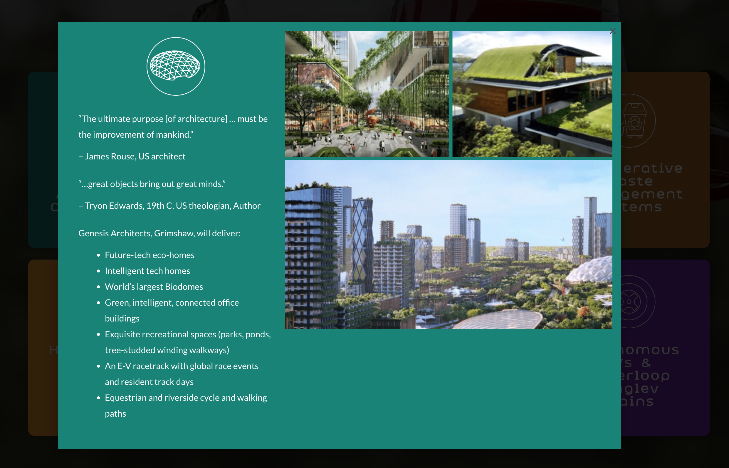
One core feature is that it will house an interconnected network of 9 of the world’s largest Bio Domes, each with a unique habitat, environment, and population of endangered, indigenous, or exotic flora and fauna.
The final logo celebrates this Bio Dome feature and uses a hand-drawn custom font. Various other ideas were pursued, ranging from the very abstract to the highly illustrative.
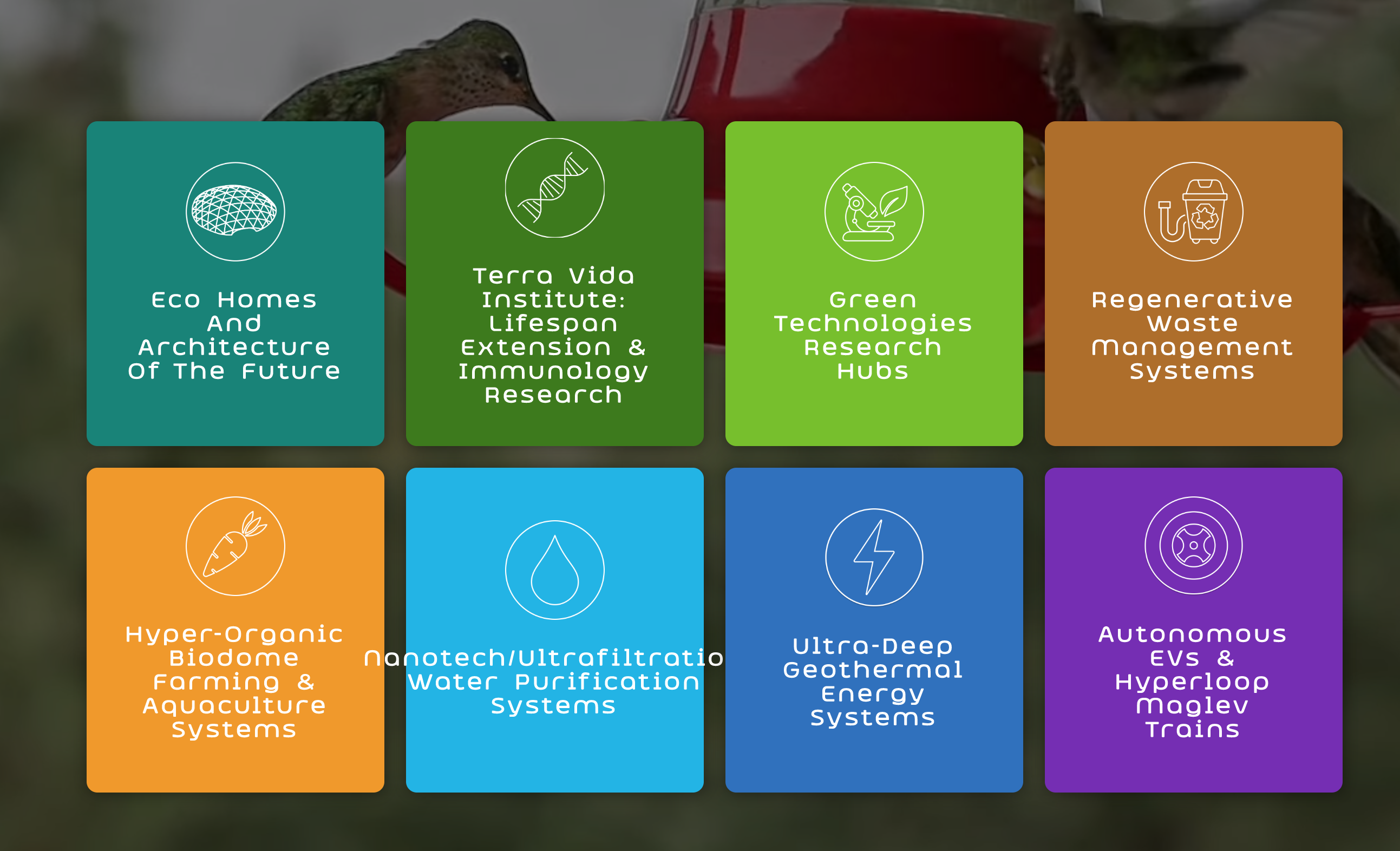
A series of diagrams and icons for eight regenerative technologies were developed for Power Point, PDF and Website presentations.
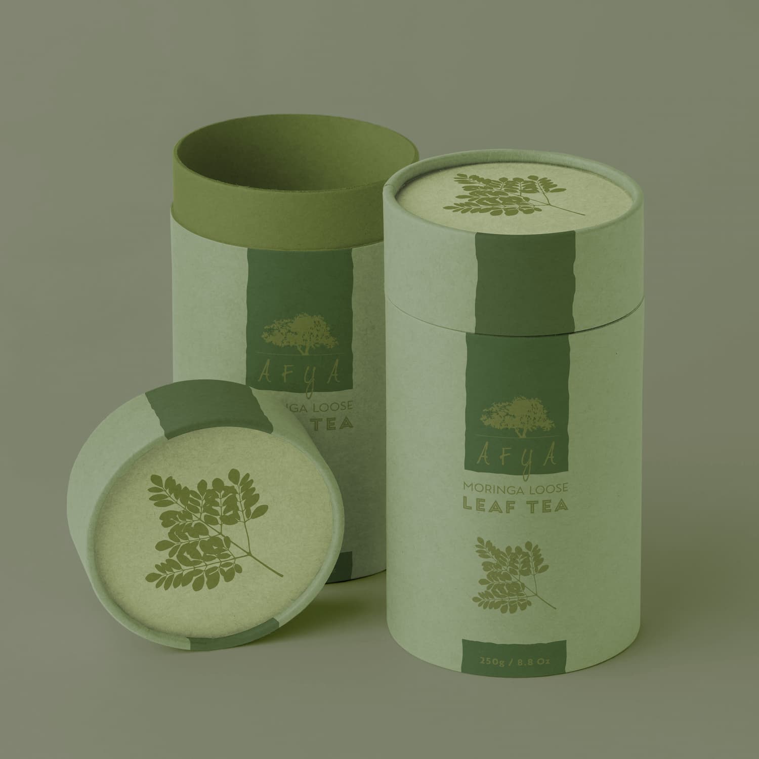
The Moringa Tree, Native to Southern Asia was introduced and flourished in East Africa’s arid croplands in Kenya, and especially in Uganda. Afya (Health or Wellness in Swahili) has produced a range of products for local and export markets to capitalize on the extraordinary health benefits of the Leaves, Root Bark, Pods, seeds and Flowers of this unique tree.
They needed a logo that was organic and upmarket enough for merchandising in US and European cosmetics stores
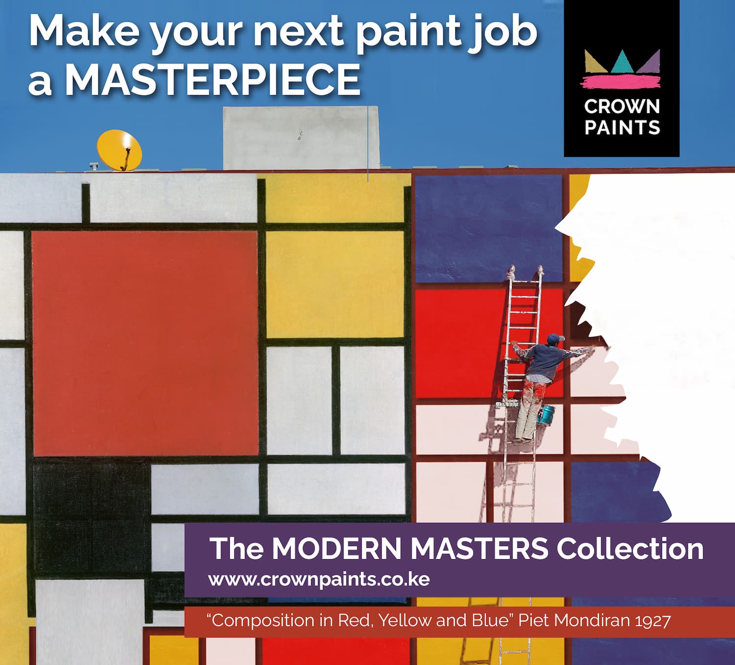
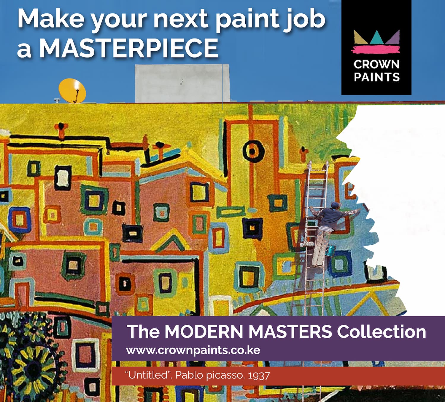
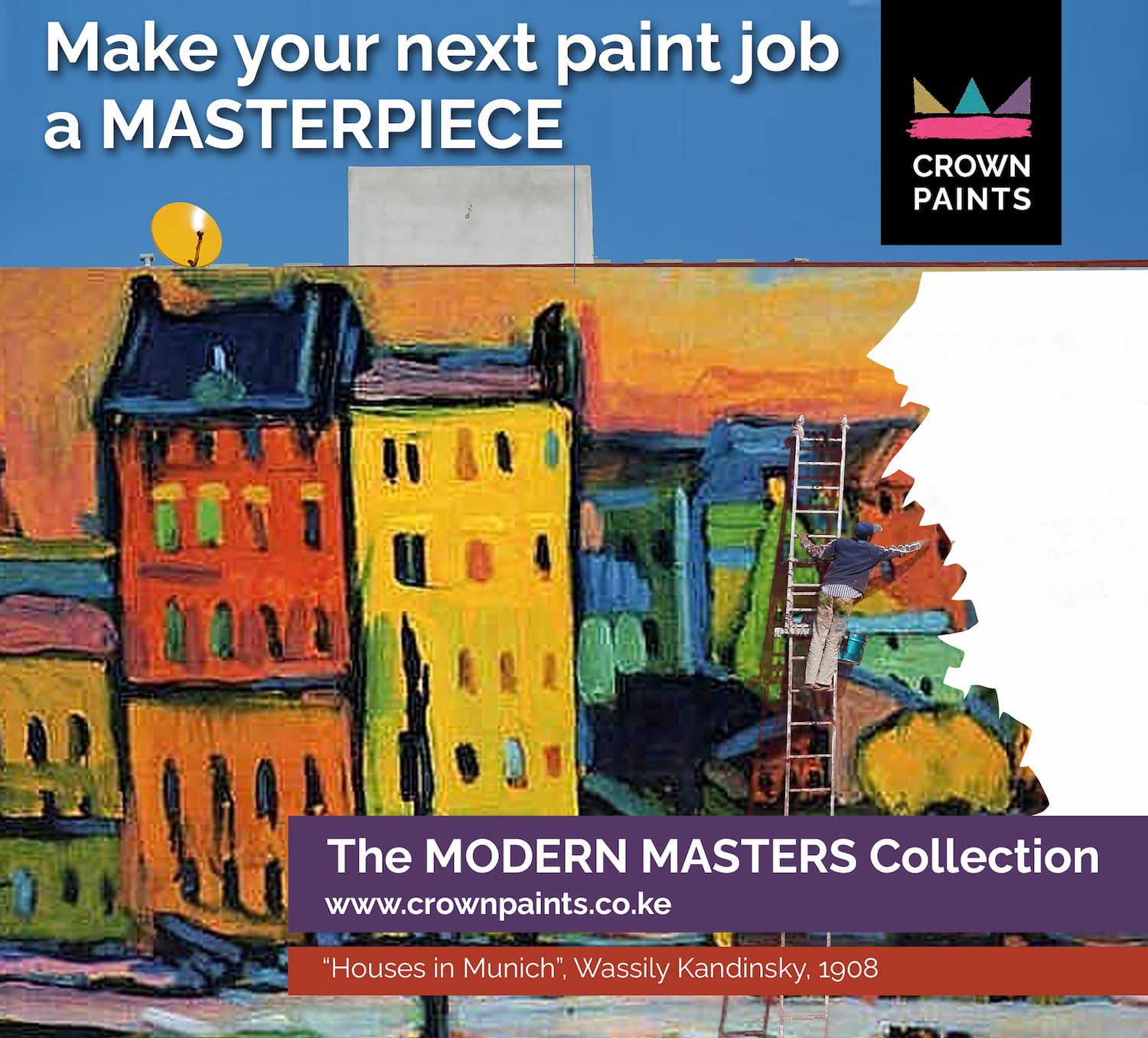
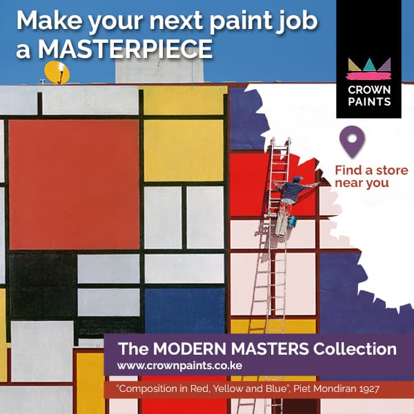
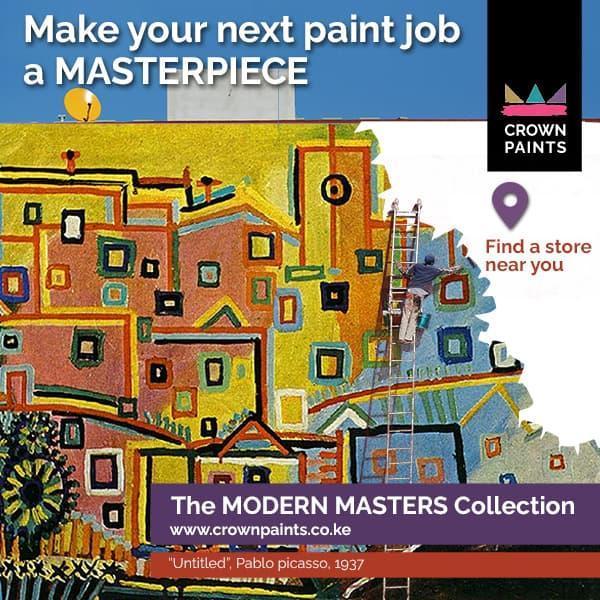
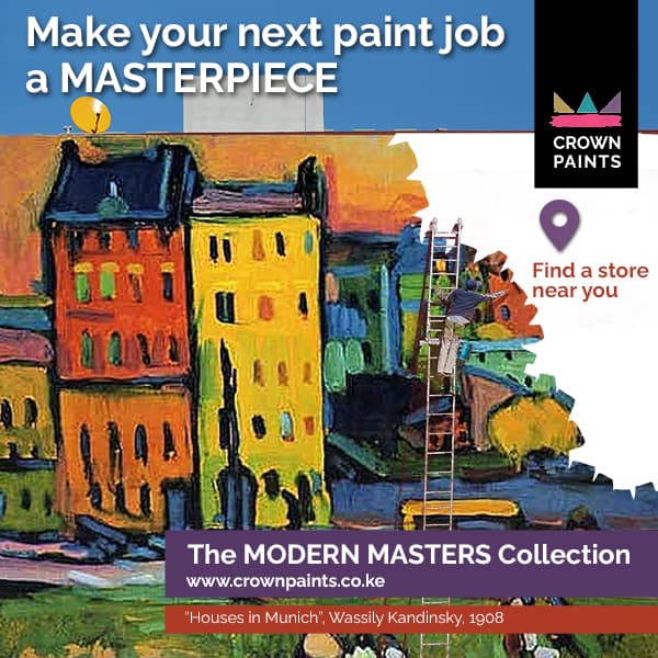
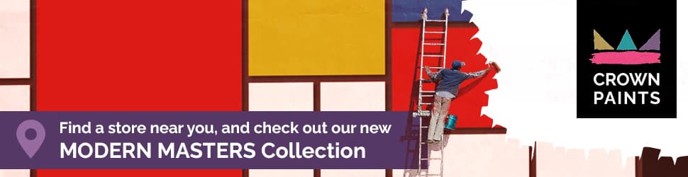
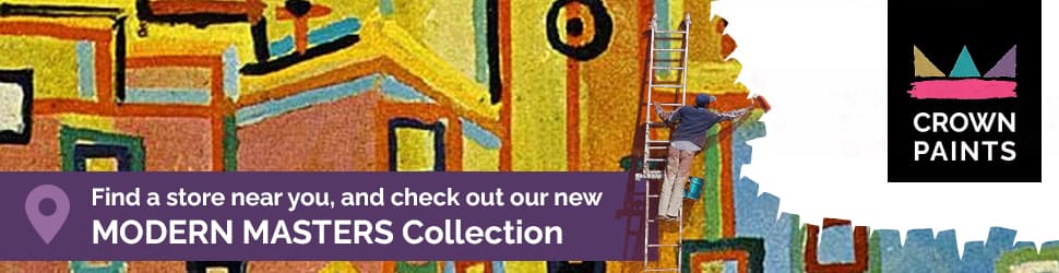
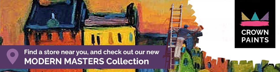
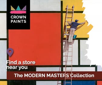
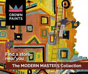
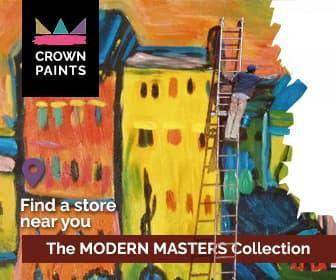
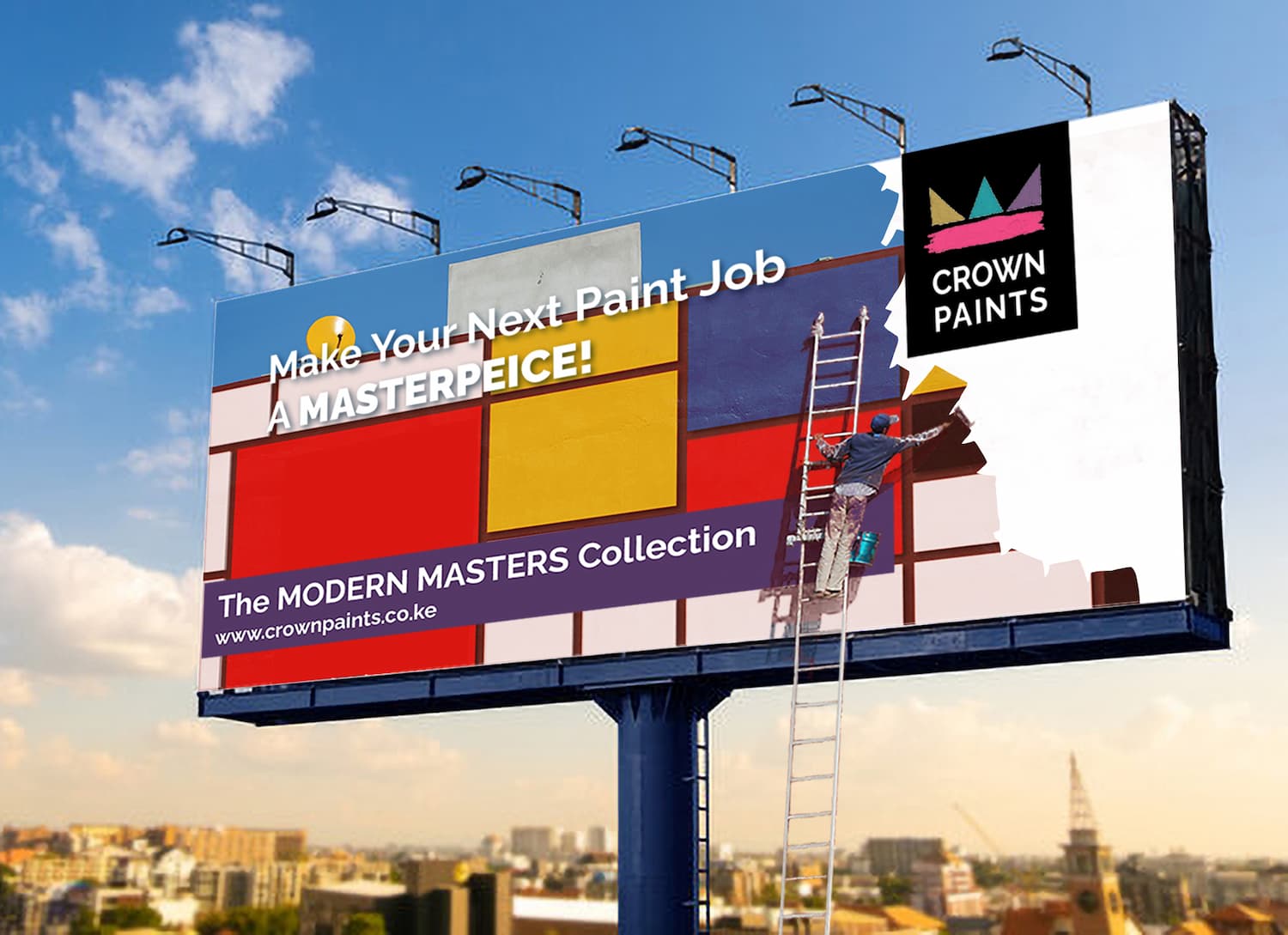
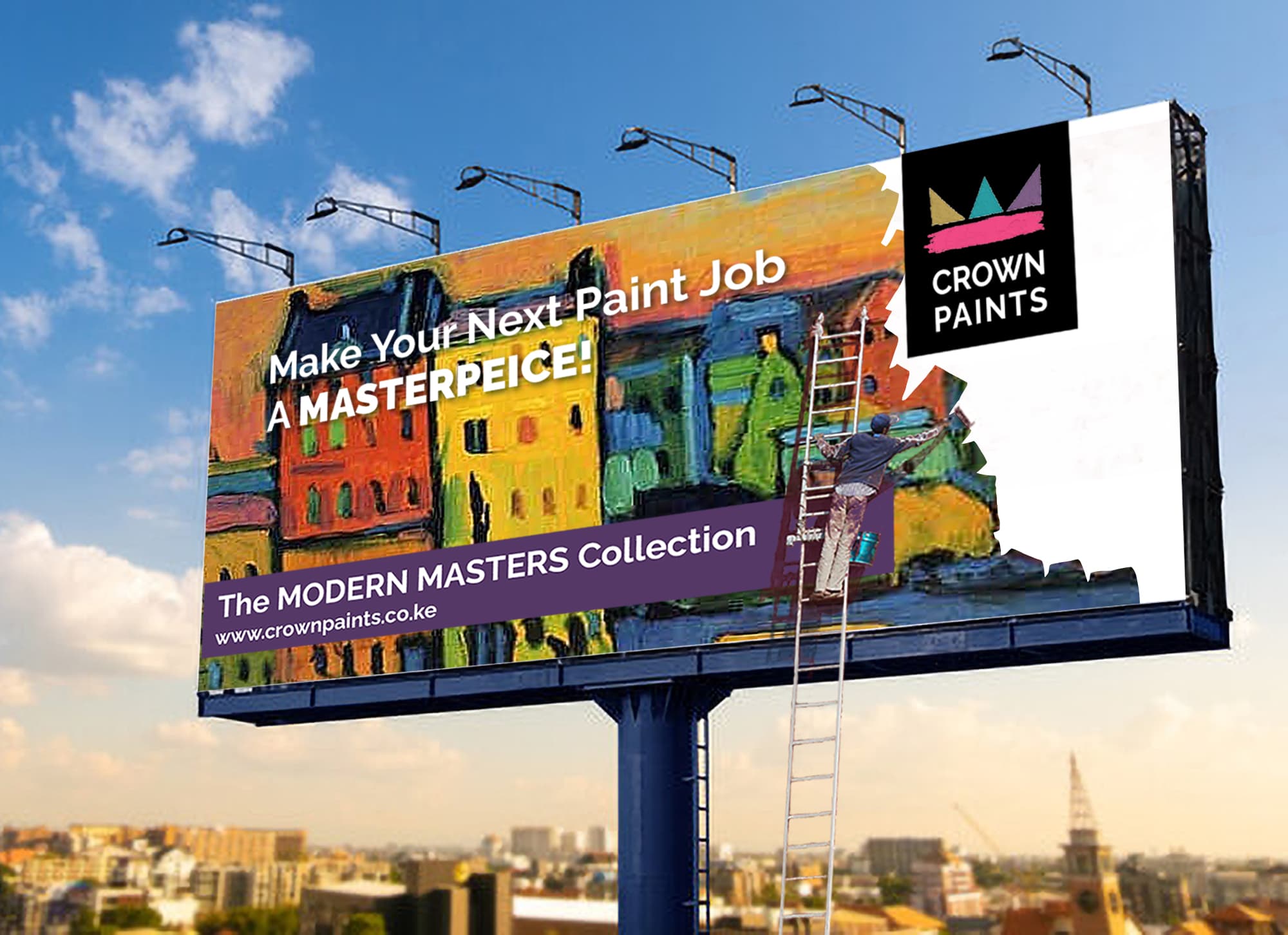
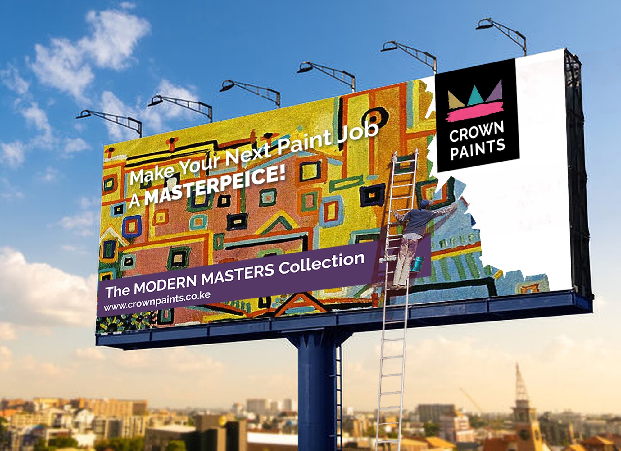
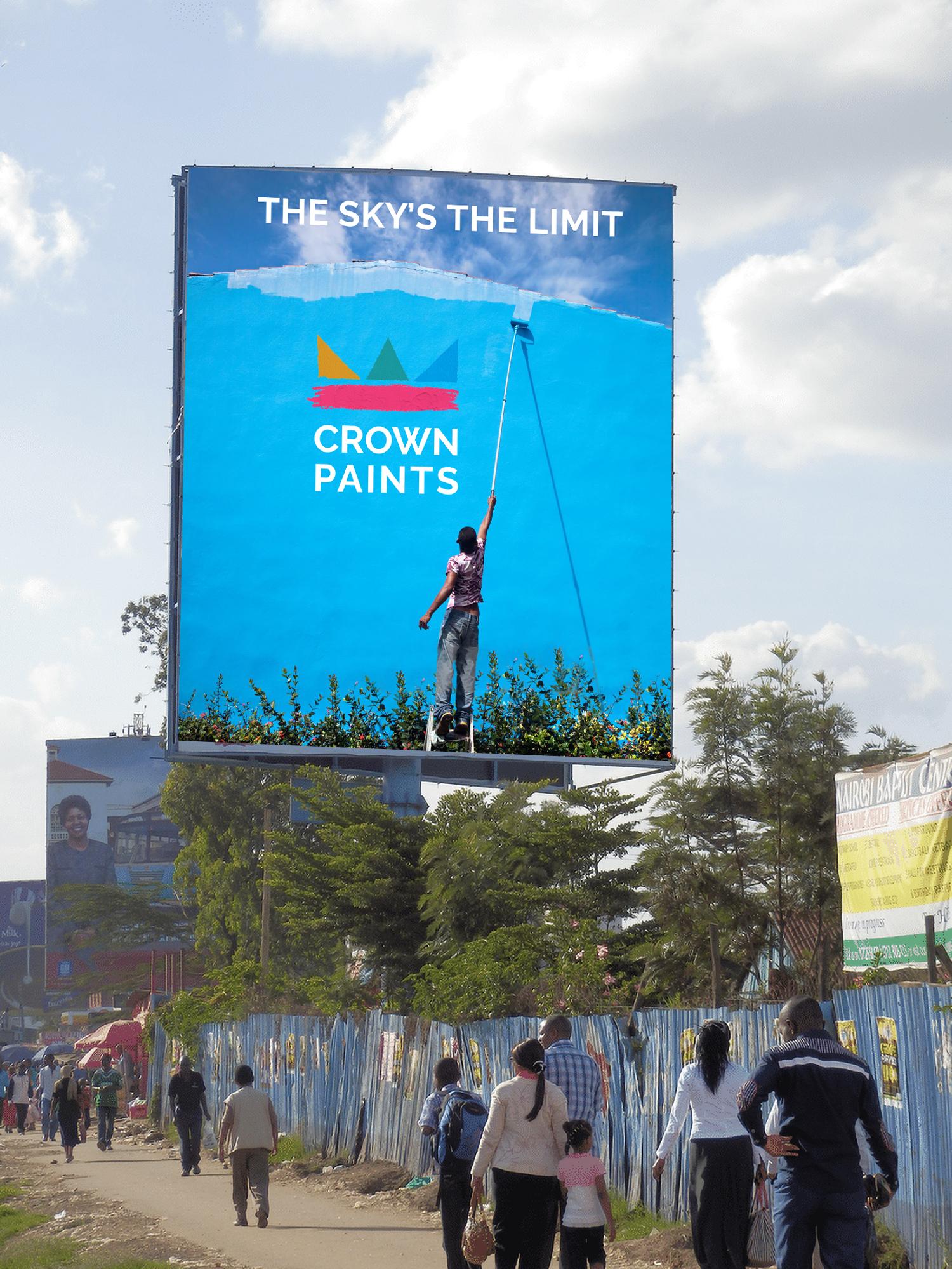
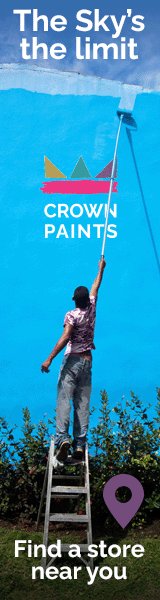
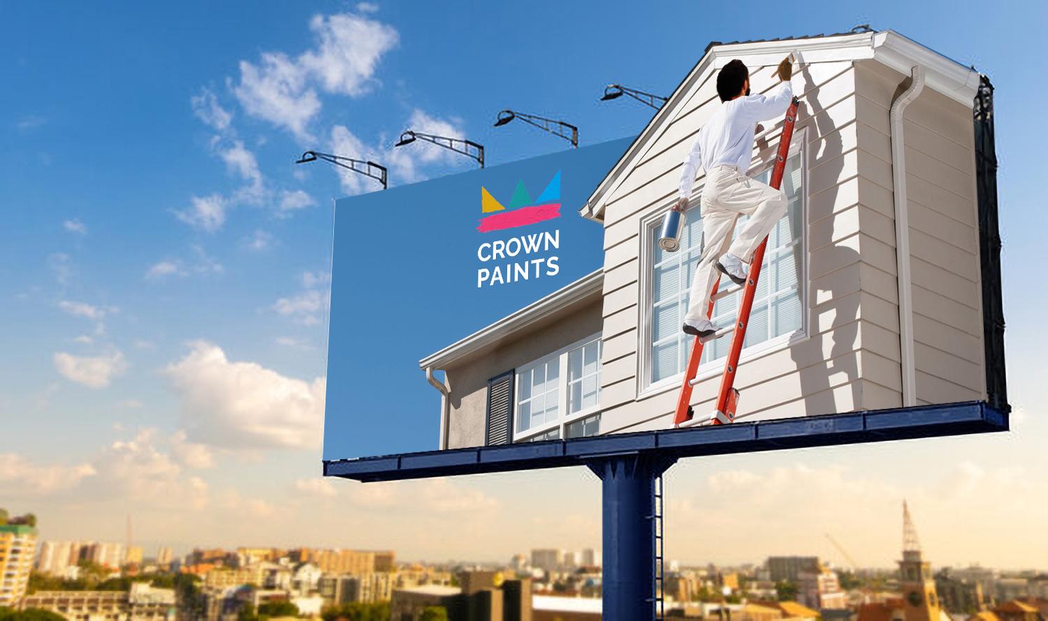
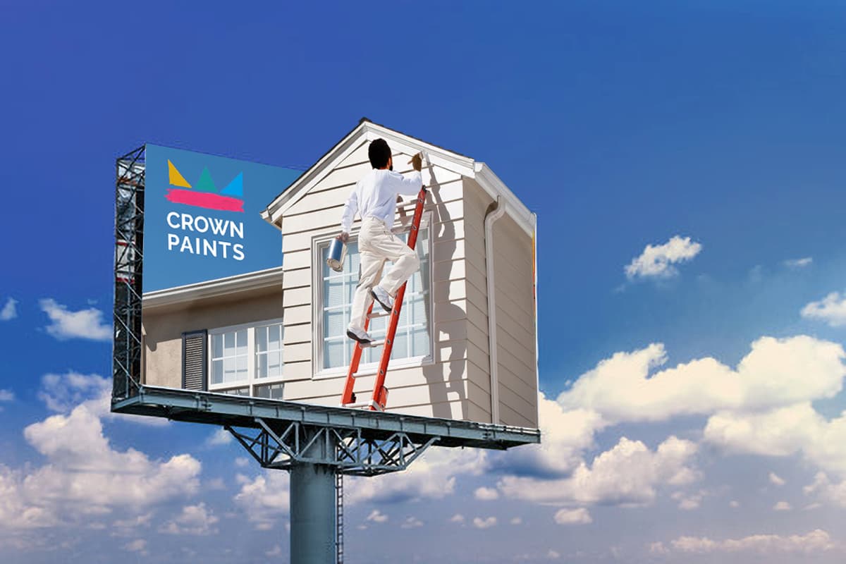
Crown Paints is a leading East African paint manufacturer and a major brand in Kenya’s marketing landscape. In 2020 they were considering a rebranding program to modernize their 1980s image, and were launching a bold new colo rline called “The Modern Masters Collection” taking palette inspiration from fauvists such as Henrei Matisse and André Darian, impressionists such as Vincent Van Gogh and Paul Cezanne and abstract artists such as Piet Mondrian, Pablo Picasso and Wassily Kandisnky. A new logo was developed to reflect a bold color palette and several series of digital and print ads prepared.
To launch their new “Modern Masters Collection” of artist-inspired exterior acrylic paint colors, Crown developed concepts for a range of billboards, featuring a 3D fiberglass manniquin atop a very long extension ladder, painting an industrial wall to display iconic artwork from Piet Mondrian, Wassily Kandinsky and Pablo Picasso, each featuring a depiction of houses. Billboards were also planned featuring
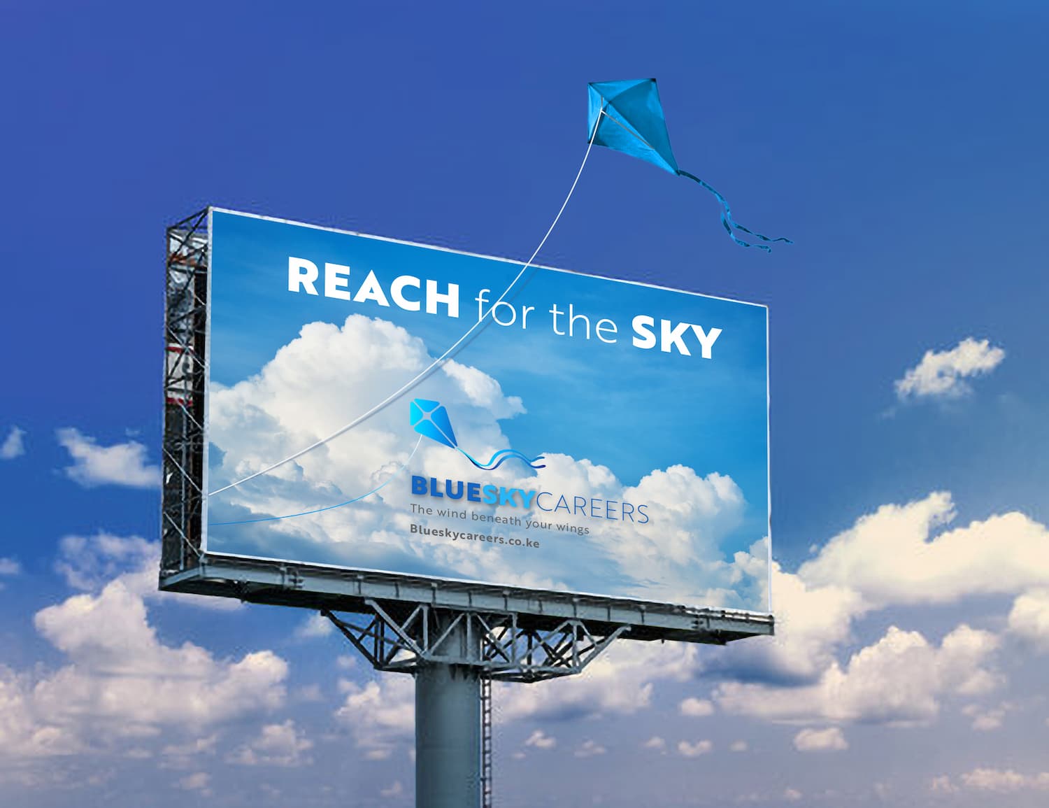
BlueSky Careers: Brand and Marketing Communications
Rationale:
New Nairobi careers consulting firm, BlueSky, wanted to leverage the buoyant and growing market of middle-income professionals who aspire to a better career. This rapidly expanding segment has only in the last decade started to behave like Western professionals, and actively seek better jobs while currently employed. To this end, BlueSky, formed by three former corporate headhunters with international experience, wanted to tap into the aspirational enthusiasm of the new middle-income professional and was looking for an image to capture the spirit of reaching for the sky.
The giant kite billboard (18 m x 10 m) features a real oversized kite, held aloft and in place by a curved section of white-painted rebar.
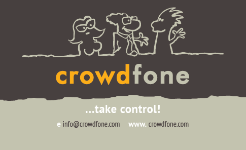
CROWDFONE: Logo and UX Design for innovative mobile telecom startup
Rationale:
Crowdfone needed an identity that communicated the irreverent, quirky nature of the brand, which was set up to disrupt traditional bundle-based contract telecom brands in the Netherlands.
A fun, cartoon image was chosen, the characters within which customers would hopefully identify with.
The font, Motor Oil, in extra bold, is both retro and distinctive with its pointed “w” tips and suited the two-color treatment.
Previous
Next
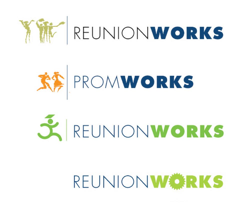
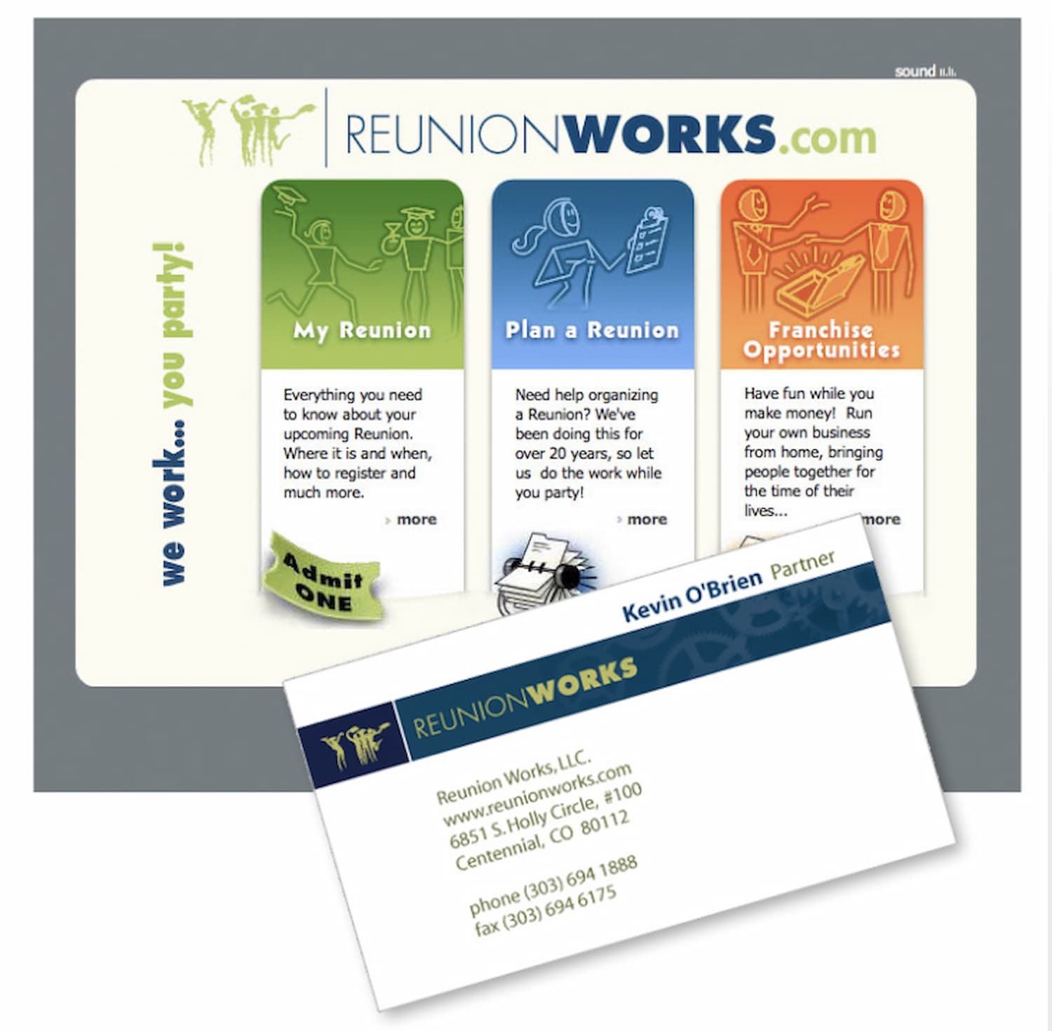
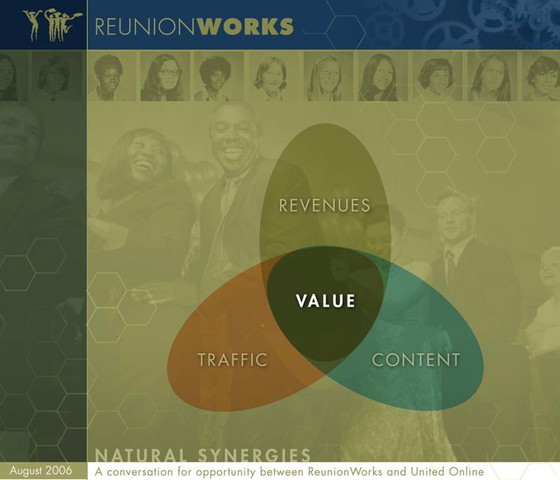
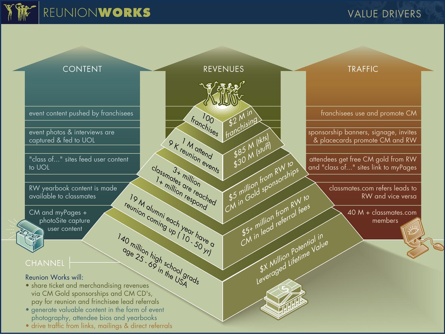
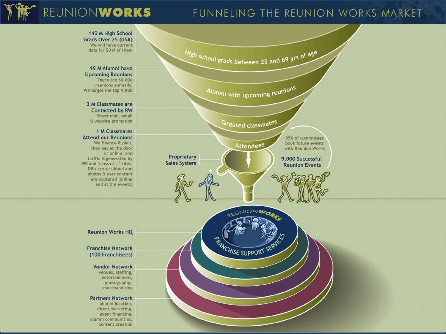
REUNION WORKS: Branding and styles/palette system for stakeholder communications
Rationale:
Reunion Works was a startup catering to the nearly 19 million annual high school and college reunion goers in America. They needed to express friendliness and accessibility, yet trustworthiness and organizational prowess, and the founder preferred muted pastel colors.
A logo concept sheet was produced and the winning concept developed into a brand system.
A distinctive diagram palette and style were developed to extend branding consistently across all communications.
Previous
Next
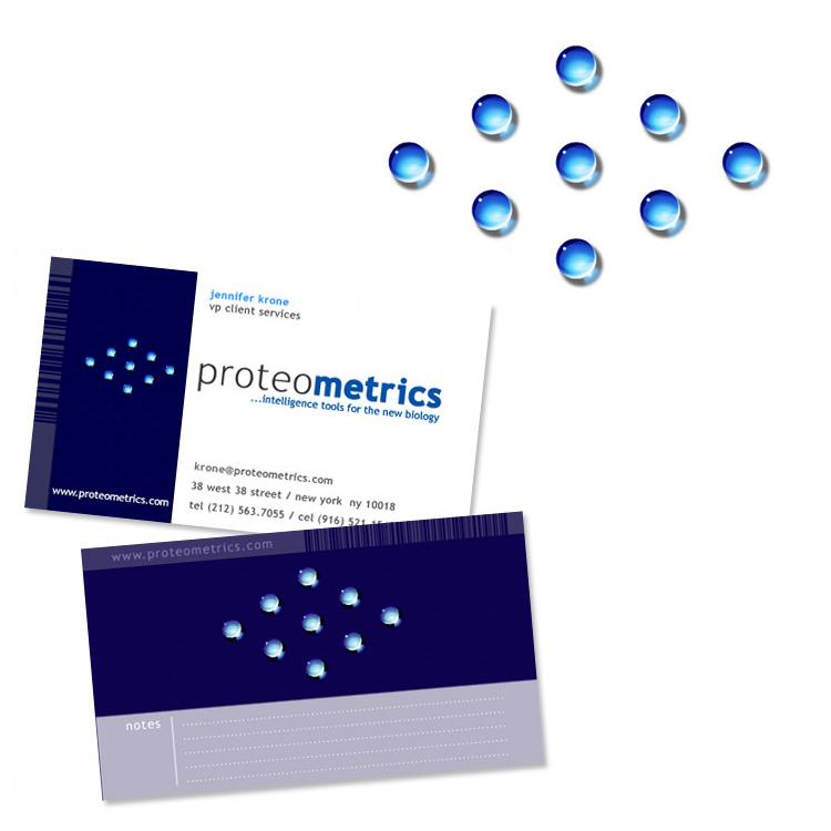
PROTEOMETRICS: Branding and interactive communications design system
Rationale:
Proteometrics was a small New York bioinformatics firm offering groundbreaking software that significantly reduced the time it took scientists to search databases in mass spectrometry operations of drug research.
I rebranded the firm with a striking logo representing the gel matrix process at the heart of mass spectrometry. I then productized and branded their various applications into a suite of discrete apps and created communications collateral to visualize the value propositions and processes behind these products.
Previous
Next
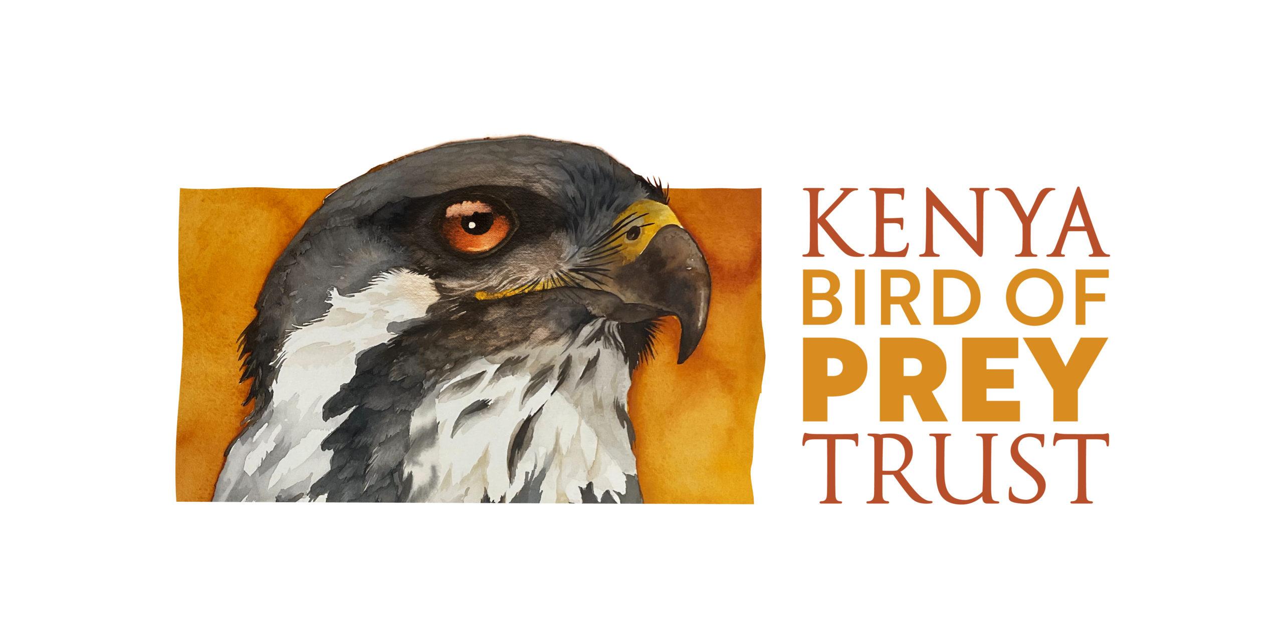
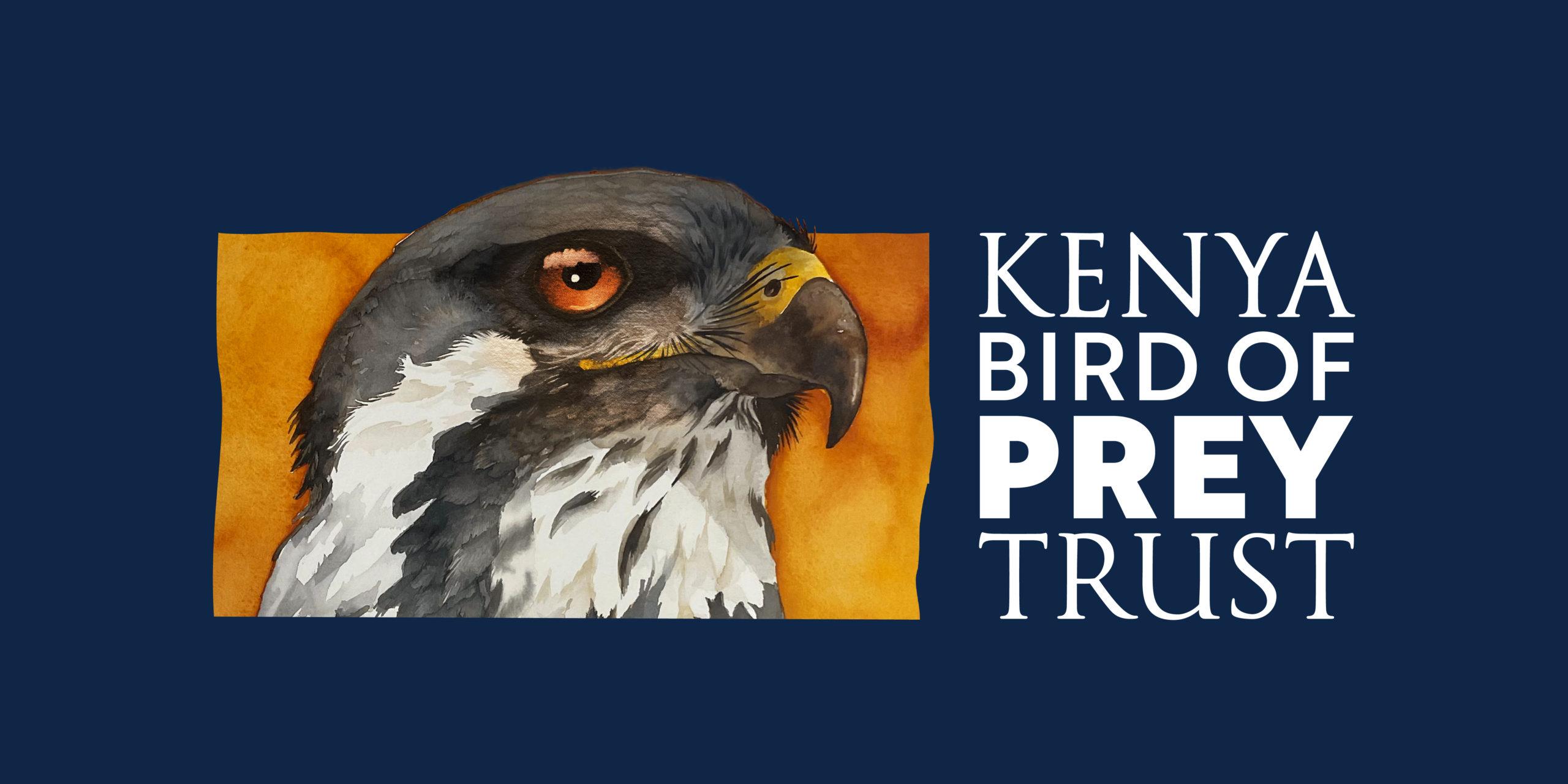
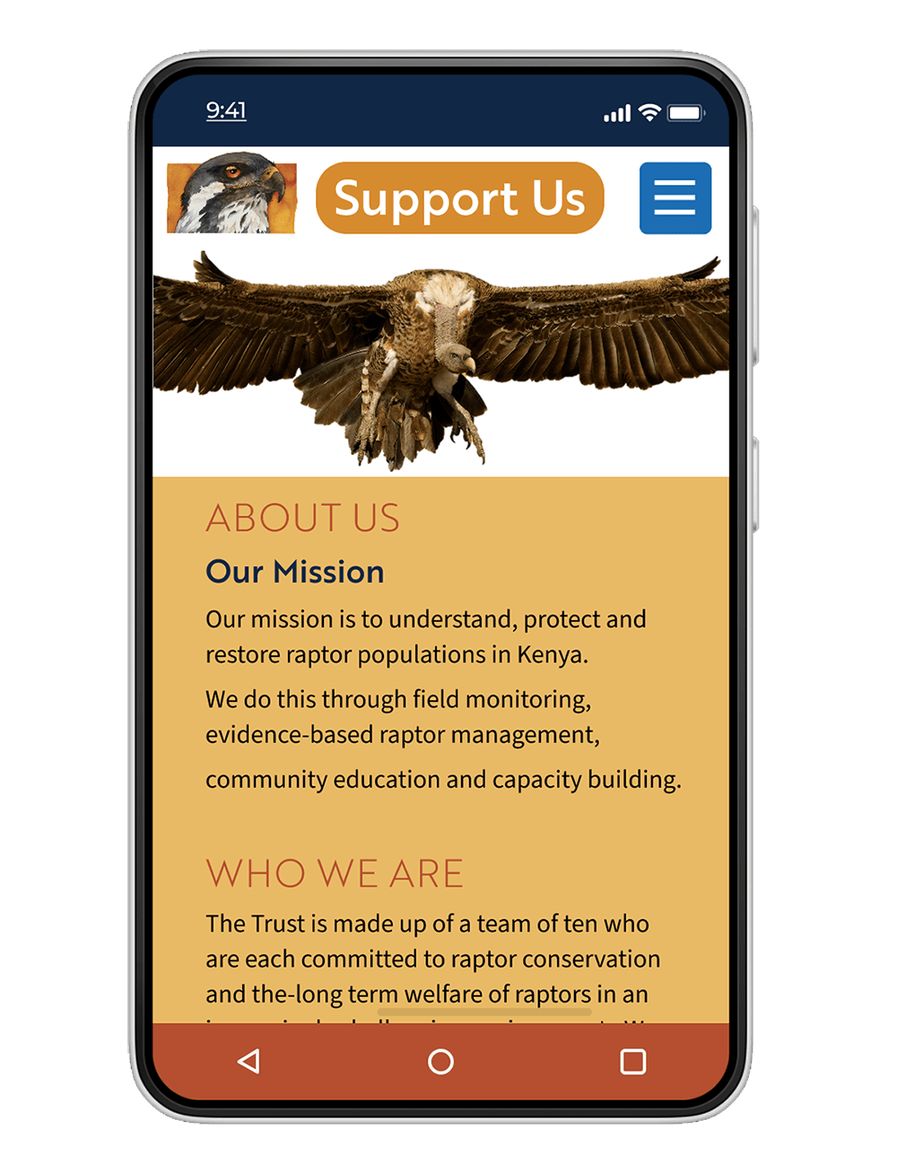
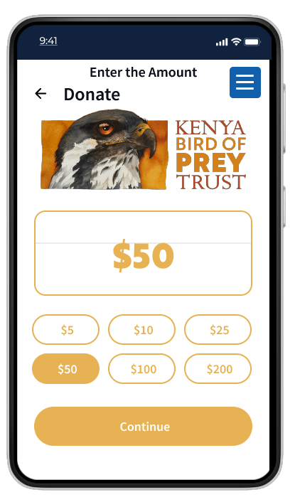
KENYA BIRD OF PREY TRUST: New logo and brand guidelines for mobile web.
Problem:
Kenya Bird of Prey Trust recently got recertified by the Kenya Wildlife Service as a sanctuary. With this development came more funding and more opportunities for strategic partnerships and tourism. All of this required a new website and logo, reflecting their commitment to and celebration of raptors. As 90% of Kenyans browse the web from a mobile device, the site needed to be fully responsive.
watercolor of an Augur buzzard, that I painted in Kenya, using photo references I had taken of “Gene” a long-time resident of the sanctuary at Naivasha.
I produced a comprehensive brand guidelines document, that you can browse below, including web, type, and palette systems.
I designed the website UX using Figma (click HERE to see the Figma UX site).
MOMENTUM CHANGE MANAGEMENT: Ad hoc marketing strategies and team managment consulting group.
Rationale:
Momentum was a group formed by staff and graduates from Massey School of Business in New Zealand. They needed a distinctive logo and brand system that conveyed the dynamic and fluid nature of the emerging business landscape while implying a certain pace and capability of working at speed and keeping up with new trends, strategies and business models.
The modern, bright orange palette, with a distinctive deconstructed “M” logo, conveys the evolution of business from a single, monolithic, centralized structure to a more fluid, discrete network of interconnecting components.
Pamoja Amani Upendo: (Together, Peace & Love) Performing Artists Association, Kenya
Rationale:
PAU is a Kenyan performing artists collective with a mission to bring peace and love to the world through music. They have been involved in artist exchange programs between Kenya and Germany and set up music festivals across Kenya.
We chose Picasso’s famous dove sketch as the basis, replacing the olive twig with a music note and coloring the outlines in a warm yellow/orange/red gradation. The chalk typography implies friendliness and informality and adds to the dynamic, free-form style of the logo.
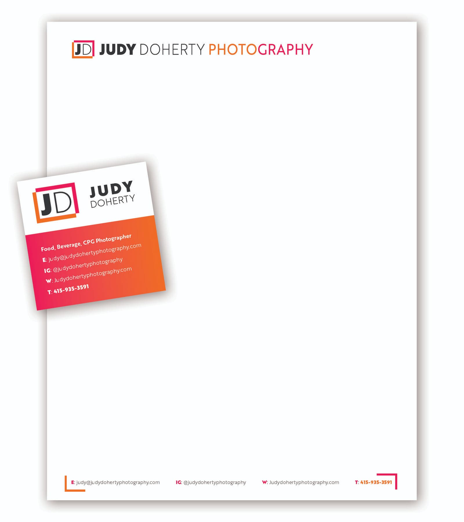
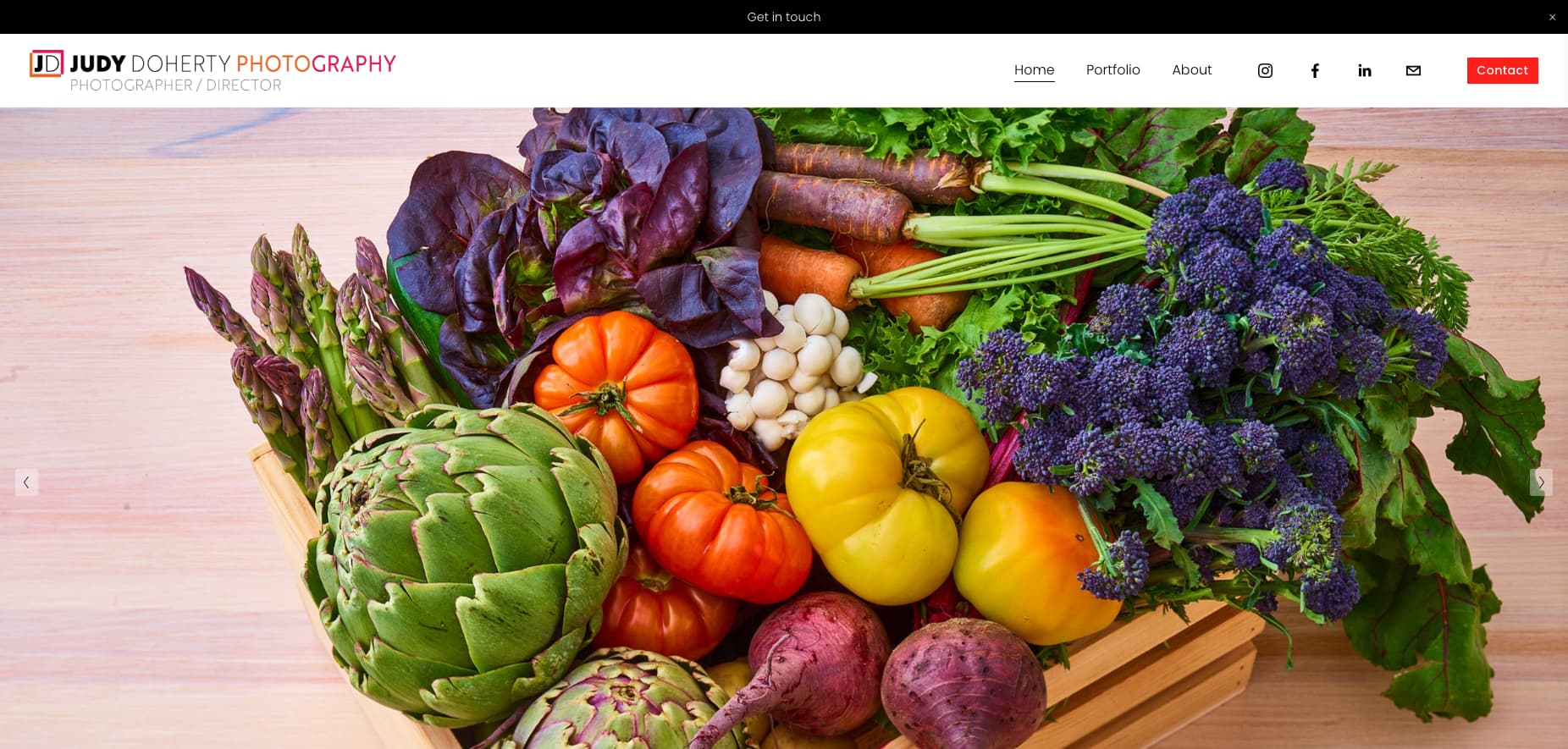
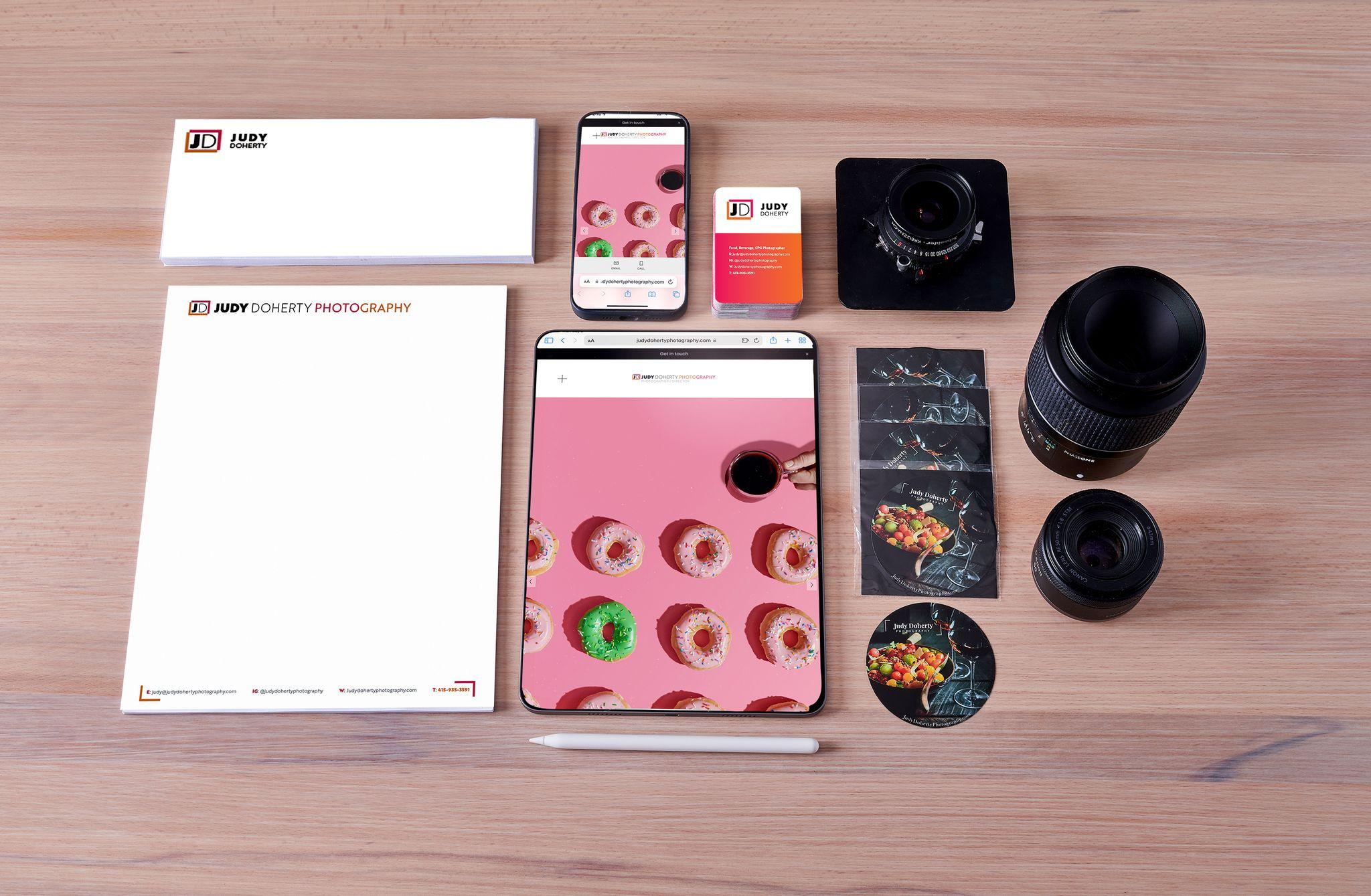
Judy Doherty is the founder of Food and Health Communications, Inc. As a separate enterprise from her educational products, she is a highly successful food photographer and food video director. She needed branding for her new portfolio website.
I chose a modern palette that I knew Judy was fond of (Tangerine and Fuschia) and created a bracketing design around her initials to represent the forefingers and thumbs of a director framing a video or still shot. I used Brother 1816 font to convey a retro “substantial” or “monumental” feel, with varying font weights to imply flexibility and creative range.
FOOD & HEALTH COMMUNICATIONS: Brand Identity/Logo
Rationale:
Food and Health Communications is a leading publisher of food and health-related educational material. They needed a logo that would humanize the brand and convey vitality.
The simple, dynamic, chalk-scribbled human figure celebrates life and welcomes site visitors with open arms. The rollover reveals a palette of magenta, teal, and yellow, that resonates with youth and educators alike.
Previous
Next
FOOD & HEALTH COMMUNICATIONS: Various logo designs for subbrands and related offerings.
Rationale:
FAH was founded by nutritionist and food photographer Judy Doherty. Judy needed a vital, kid-friendly, and dynamic brand for her global educational site, supported by a nutrition-focused subbrand – the “Nutrition Education Store”. Various products and sections within the site needed logo identifiers, i.e. “Nutrition Month”.
She also needed separate, more professional logos for her general photography website and her specialized ZBoosh brand of food and recipe images.
Previous
Next
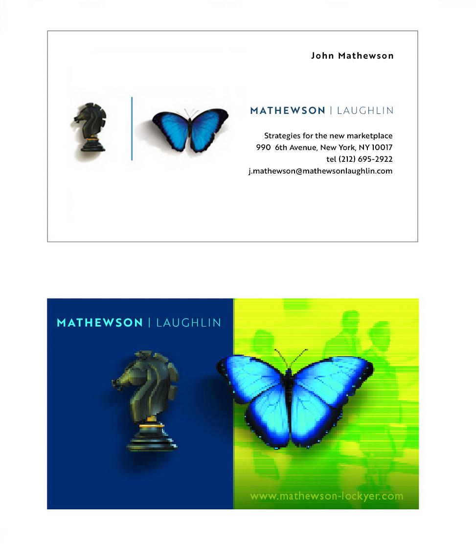
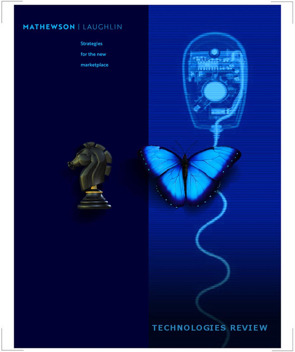
MATHEWSON/LAUGHLIN: Management consultants for the new economy.
Rationale:
Mathewson | Laughlin was a millennial transformational management consulting form, offering temp CEO, temp CTO, and temp CMO services by its senior team of consultants. They wished to convey a modern, tech-savvy image with both creative and strategic capabilities.
The electric and deep navy blue/luminescent lime green palette showcased a 3D-modeled chess piece (Knight) and a digitally illustrated Morpho butterfly. The theme is consistent across business cards, websites, and printed/pdf proposal and recommendations documents.
Wanene: Entertainment and recording artist publications group, Tanzania.
Rationale:
Wanane, Tanzania’s leading recording artist production group, was expanding through strategic alliances to offer entertainment services, and wanted to present a brand identity that was more expansive and inclusive. The rainbow version of their formerly solid blue “W” logo was seen as the appropriate evolution, while still retaining their established identity.
LIFE STAGE VENTURES: Capital firm focused on strategic marketing relationships.
Rationale:
LSV evolved from Reunion Works, a high school and college reunion events management enterprise. Realizing that identifying people, such as college graduates, newlyweds, first-time home buyers, etc. represents massive marketing opportunities, the firm developed a consumer intelligence and knowledge management platform to funnel candidate information to partners and clients.
The logo shows chalk outlines of people as they embrace p[ositive life changes, and the Futura sans serif font in light and black is both inviting and balanced, aesthetically, but also establishes confidence.
Previous
Next
VILLAGE WATER: Community-centric, sustainable, and transformational social enterprise founded to bring safe affordable drinking water and cheap renewable energy to water-stressed communities across Africa.
Rationale:
Village Water Africa Ltd, and its subsidiary Village Water and Power, needed a modern image that was still accessible to remote rural inhabitants across Kenya, Tanzania, and Uganda. The map encapsulated within the water drop speaks to the pride in the enterprise being African, instead of, as is traditionally the case, a foreign multinational or NGO initiative, while the rounded font communicates firendliness and community accessibility.
Previous
Next
Access BoP/MicroSolar: A transformational, sustainable New York ventures firm founded to foster strategic relationships and funnel investments for social and economic development projects worldwide.
Rationale:
Access BoP was inspired by C.K. Prahalad’s seminal book ‘The Fortune at the Bottom of the Pyramid. The concept is that those at the base of the pyramid (BoP) represent significant spending power (5 Trillion in 2007), and can be empowered simply by inclusion across the supply and value chains of big business. The logos express the network value of human beings, with the Access BoP logo formed of a pyramid of people while the characters of Micro Solar from a swirling sun.
The rough, hand-drawn logotype conveys humility and humanism – dynamic confidence, without arrogance or superiority.
Previous
Next
THE AXIS GROUP: A prepress, print production, and graphic services firm, supporting New York ad agencies and major consumer brands.
Rationale:
Image Axis wanted to convey a solid, reliable image, that expressed its clean design aesthetic. Knowing it would be launching subbrands, the firm also wanted an extensible system to identify themselves across vertical offerings. The cutout arrowhead simplification of the “A” in Axis was chosen to graphically represent the brand, against solid geometric panels, with a white ball employed as a diversion to interrupt the absolute symmetry.
This carried across to Axis Interactive, their web-services brand, that used the same cutout “A” but set into an oblique ellipse, represented global orbit, with the white ball placed as an orbiting body (user). The ellipse casts a shadow on an imaginary ground plane, establishing solidity
GAZOMBO: A casual interatcive games brand.
Rationale:
Gazomba was launched in competition with brands such as Big Fish Games, to offer more quirky, predominantly sci-fi-themed interactive games for the $2 Billion plus casual games market.
The logo developed features a fun, kid-friendly lime green alien with stalk eyes, forming an ellipse to frame the friendly, informal logotype in bright orange.
BRILLIANT IMAGES: A slide imaging and desktop publishing studio in Sydney, Australia.
Rationale:
The firm had coincidentally just produced a set of sales and marketing presentations for Ray-Ban sunglasses, and the client and I joked about riffing on the “My future’s so bright, I gotta wear shades” song by Timbuktu, or Corey Hart’s “I wear my sunglasses at night” as backdrops for the Ray-Ban’s slideshows. The idea clicked and the new Brilliant Images brand became a pair of wayfarers, digitally illustrated, represnet8ing that the “images are so bright, I gotta wear shades” with a hand-drawn rainbow line underneath to represent the RGB spectrum.
Previous
Next
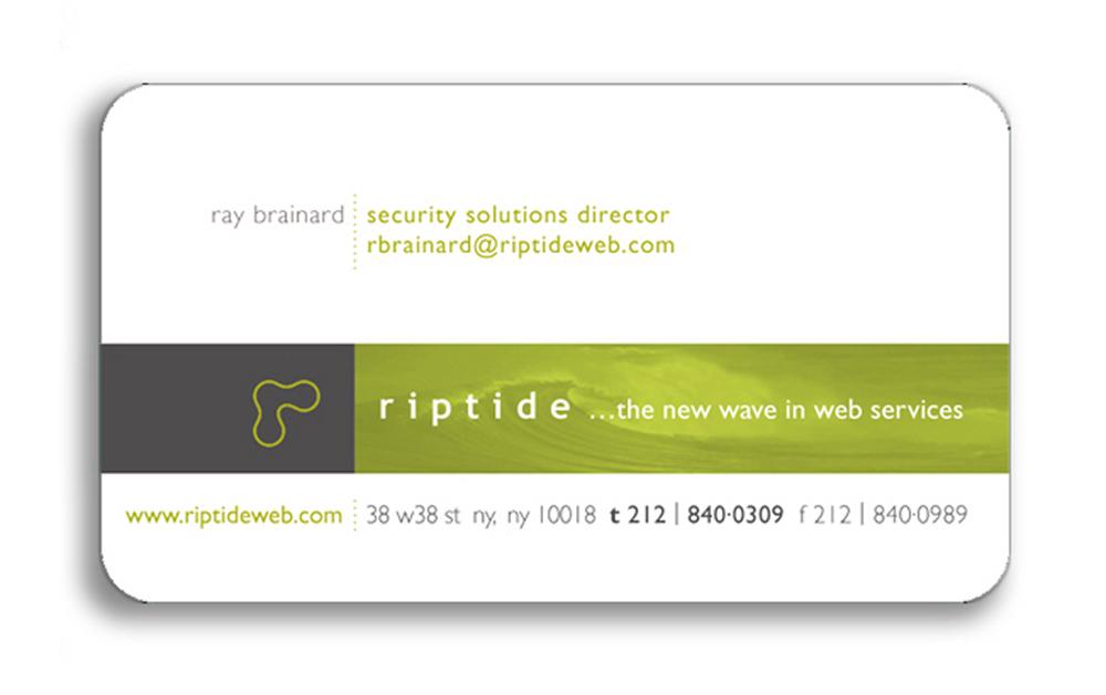
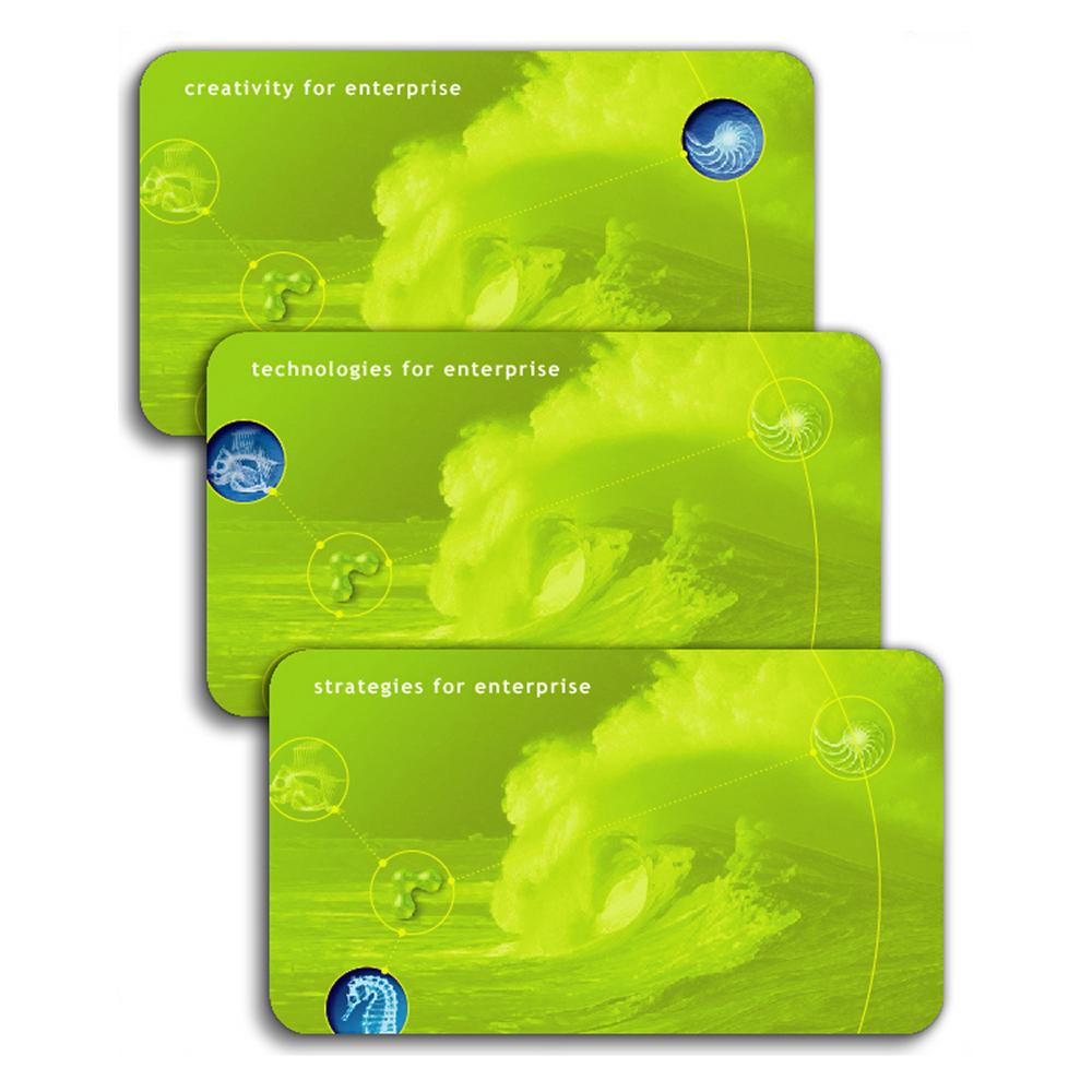
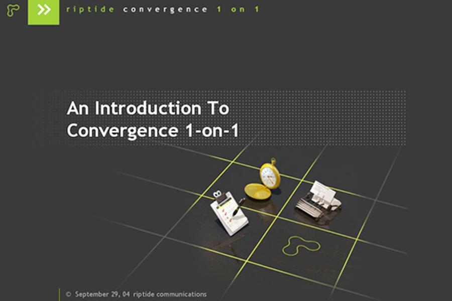
RIPTIDE INTERACTIVE COMMUNICATIONS: Logo and design system/palette for web, stationery, diagrams and proposals
Rationale:
Riptide was a cutting edge interactive communications agency, founded in 1996. I quickly won accounts such as Condé Nast, Visa, and SkyMall, and part of the success can be attributed to our branding and proposal templates. The three aspects of community, content, and commerce were represented as interconnected gelatinous nodes, in luminescent green, encircled by a bright lime ring and dot, indicating an orbiting body. A dark warm grey was used to offset the lime of the logo and a simplified outline representation was used in banners.