Step-by-step Process slideshows
A breakdown of key processes and steps for several of my wildlife watercolors. with photos taken while I was painting, to capture specific techniques and pocesses.
Tim: steps to an International award winning work.

When I heard that one of the last and largest of Kenya's giant tuskers, Big Tim, had died of natural causes in March 2020, I was saddened, not just for the passing of this iconic gentle giant, but because I never got the opportunity to photograph or paint him while he was alive.
Thankfully, world renown wildlife photographer, Tim Yarrow, had taken some spectacular photos of Tim just before he died (Tim, not David!).
This truly dramatic, strongly lit portrait was my inspiration and reference.

I extended and curled the trunk from David's photo, but otherwise reproduced Tim pretty faithfully, and digitally inked in key outlines to print out and transfer to my light box.

I printed out a 5" x 7" outline sketch and used that to create a small scale study to experiment with color palette and contrast.

I printed out a 22" x 30" black and white print of the outlines and taped them to my lightbox, laying my sheet of Lanaquarelle 300 lb rough over the top. Outlines can be clearly seen through the thick, 300 lb (640 gsm) watercolor paper, thanks to the equivalent of 800 Watts of LED light.

I used a 2" mottler brush to lay in the golden ratio background panel fading from Burnt Sienna and Permanent Orange to Hansa Yellow, and painted the base under-glaze in paler tones of Hansa Yellow to create a translucent golden light to inform the following layers of pigment.

I tested sea salt and glazing techniques for Tim's right ear on a 5" x 7" piece of Lanaquarelle 300 lb rough, and experimented with how much over-glazing the paper would hold and what effect it had on the sea salt texture underneath.

I block in the basic tones of the right ear, using a 1" oval flat synthetic brush, over-painting the highlighted plane of pale hansa yellow a slightly deeper tone, then liberally sprinkle sea salt while the paint is still very wet.

The sea salt creates a perfect, dimensional "pebbled" skin texture, forming micro blooms and pigment accretions where the salt has absorbed water and pigment into each crystal. The random size and shape of sea salt crystals adds to the dynamic range of textures. Textures are more distinct where the paint was wettest and the tone deepest.

Using the 1" oval flat brush, with Alazarin Crimson, prussian Blue and Burnt Sienna, I glaze over the darker half of the head, laying in some crevices while satin wet, so th eedges of the line work naturally bleeds a bit. I leave areas of background clear to prepare for highlighted bumps later.

Here you can see the natural pebbling created by the sea salt, accentuated with fine linework to begin to create the structure of the wrinkles on the shadowed half of the trunk.

Here you can see I have loosely created the basic forms for the tusks, and have extended the shaded side of the trunk downwards. I've also added some details to the wrinkles on the dark side of the head.

I glaze over the background wash with light tones of Hansa Yellow, Permanent Orange and Burnt Sienna, and use Alazarin Crimson and Prussian Blue to block in the shadowed areas of Tim's left ear. I also paint in the lighter side of the trunk in slightly deeper tones, as the trunk curves down away from the late afternoon light and I extend wrinkles from the shaded side of the trunk for continuity.

I lay in a second very wet glaze of deeper tones to the ear, the light side of the head and light side of the trunk, then liberally sprinkle with Sea salt (a second time) for texture.

The sea salt textures are much more subtle in the lighter tones, as expected, yet the groundwork for pebbled skin is definitely there. Here I have also just started to lay in key wrinkle lines around the tusks.

I lay loose wet-on-wet washes with deliberate blooms to build up the base layer of the body and legs, leaving the front right leg more loosely defined with strong highlights to represent low sunset light catching the knee as it bends forwards.
Then I sparsely sprinkle sea salt for added texture.

Here you can see larger sea salt crystals. I am only salting the shaded part of the leg at this time.

I begin the fine line-work which defines the wrinkled skin along his flank, paying careful attention to the patterns indicated in the reference photo. A sloppy generic cross hatching won't create the depth and contours needed to convey reality and substance.
I lay in multiple glazed layers, not only of the wrinkle lines but also of the shadows each wrinkle creates to add depth and dimension.
I leave parts in softer focus to imply a sense of depth of field.

I lay in more glazed layers, gradually deepening the shadows of his left ear, again constantly referring to reference and switching the lightbox on to see outlines of light and shadow planes.
I lay in the groundwork for veins and wrinkles.

I do extensive line-work and glazed shading to define and add dimension to the wrinkles around his left eye and on the entire lighter side of his head and trunk. With his eyes and wrinkles, I'm trying to create a sense of vulnerability and age, as a counterpoint to the majesty and presence of his pose.

I tweak details everywhere and lay in multiple soft glaze layers to deepen the overall tone and soften wrinkles and crevices, aiming for a natural sunset lighting effect. Hopefully I have captured a fraction of Tim's majesty and presence, as well as his age and vulnerability. David's photo has the benefit of naturalism and authenticity, which I couldn't hope to replicate, but hopefully I have done David and Tim justice.


I took this photo of a cape buffalo while on safari as Sweetwaters, in Nanyuki, Kenya, 2017. I added a more impressive set of horns from a photo by Vicki Jaron, downloaded with her kind permission from Getty Images
I blended the new horns in place, stripped out the background and replaced it with one of my signature color panels in mustard/orange.


I used a 10"x8" piece of the new Legion Special Handmade paper in 300lb rough and did a quick test for composition, lighting and color palette.

I lay out, wet-on-wet, the base mustard (yellow ochre and Hansa Yellow) and charge that area with rose madder to give a sunset feel to the background panel. The paper keeps paint moist longer than most roughs, which allows for easier blending.

As is normal for me, I start with the eye, to set the mood of the piece while I am painting. Also, I just really like painting eyes. I lay in Raw Umber and Yellow Ochre, lifting a little for highlights and feather in the grey shadows over the skyline highlight at the top of the eye before forming the wrinkled "bags" under teh eye.

I quickly and loosely block in the right ear (left side of painting) and add some form under the eye. These areas are basically a form of underpainting, as I will add depth and tone with multiple glazed layers later.

Using a combination of Hansa Yellow, Yellow Ochre and Rose Madder with Alazarin Crimson, I loosely lay in base tones for th ehead, and apply the first layer of glaze over the ear. These tones will inform the lighter highlights as I glaze and add shading and depth to the piece in later stages.

I use Alazarin Crimson and Rose Madder to glaze over the ear, defining hairs by painting reverse areas with paynes grey/Alazarin Crimson (adhereing to my standard of never using black in a watercolour painting). I create shadow forms with glazed Alazarin.

I splash in a loose glazed layer of Alazarin Crimson, to set up the rich colour of the cheek.

I loosely define the shadows and highlights of the Muzzle with Burnt Umber, Payne's Grey and Alazarin Crimson, paying close attention to the reference to capture the unique glossy "wet" highlights.

I lay in a base tone of Hansa Yellow/Yellow Ochre for his left ear (right side of art) and loosely vlovk in wet-in-wet, the tones for the body, Using Paynes Grey and Alazarin Crimson. Wrinkles are loosely indicated wet-in-wet and I drop in some water to add bloom cauliflower effects as the base for patches of dried mud.

I glaze over the brow area and add cracks and creases, lifting to indicate highlights.

I glaze loosely over the bas body tones, using Payne's Grey/Alazarin Crimson, leaving some areas to be developed into pathces of dried mud later, then liberally disperse Sea Salt to create a unique random mottled texture.
I then begin to define hairs on the nape of the neck.

I lay in a loose wash of Rose Madder to set the base tone for the horns, then using the lightbox to see the complex ridges in my black and white reference outlines, taped underneath the paper, I use wet-on-wet to loosely define the ridges and striations and basic highlight areas of the horns.
I drop in some cobalt blue to set up the tone for upper horn tips.

I lpaint wet on dry, glazing over details into the horns, then use lifting to define highlights of the knobs, knurls and striations. I allowed cauliflower blooms to form in parts of the horn tips to add random stain and wear markings.

I lay in a deeper, Payne's Grey/Alazarin Crimson glaze over one side of the muzzle, to accentuate shading.

After re-glazing and detailing dried mud patches, and lifting. more highlights around the eyes, I'm finished.
Hopefully I managed to capture some of the sheer massiveness and menace of this distrusting subject!

I had photographed many secretary birds, mainly at the Nairobi National Park, over the years, but always at a distance and never with a telephoto lense, so when I decided to attempt a secretary bird painting I trolled the web and found this amazing photo. It turns out that the photographer was none other than my friend Simon Thomsett, co-founder of Kenya Bird of Prey Trust! He had no idea how National Geographic got hold of it but gave me his kind permission ti use it.

Compositing, in this case was as simple as clearing the background, cropping in tight and creating a solid blue background panel.

I very quickly laid water up to the outline of the subject silhouette and blended wet-on-wet the colors, using Prussian Blue, Cerulean Blue, Sap Green and Veridian Green, then dropped in some blooms for effect. I then glazed over to mute the bloom contrast.

I very quickly laid water up to the outline of the subject silhouette and blended wet-on-wet the colors, using Prussian Blue, Cerulean Blue, Sap Green and Veridian Green, then dropped in some blooms for effect. I then glazed over to mute the bloom contrast.

I started with the eye and Moneypenny's striking red and orange makeup. Secretary birds have very long, luxurious eyelashes, which I painted in black gouache One of the very rare times I ever use black paint from the tube!). I used aquarelle pencils and gouache to highlight the pebbled skin. this is the only part of the painting that uses gouache or aquarelle. The rest is 100% pure watercolor, meaning every feather is highlighted in reverse, leaving delicate whit etendrils of clear or lightly tinted paper to "lift" each feather from its darker background. It's time consuming, tense and tedious work, But I enjoy the unique pure result. I admit I'm something of a watercolour snob.

I loosely blocked in the base layers for the secretary bird's gorgeous crest of black and grey quills.

I darken the crest quills and paint individual feather barbs with a #3 round brush.

I carefully painted around each of Moneypenny's long soft neck quills to leave the paper as the white color and began the many small soft chest feathers.

I laid in the larger, crisper chest feathers, using Burnt Umber, Van Dyke Brown and Paynes Grey, then lined in the barbules.

The large, ruffled coverlets required many layers of glaze and massive numbers of finely painted parallel feather barbs, paying careful attention to the reference photo to capture the shadows, colours and textures.

The black for the primary feathers was mixed using Burnt Umber, Van Dyke Brown, Prussian Blue and Payne's Grey. I almost never use black out of the tube. It is a dead colour and there is no true pure black in nature. By mixing my own blacks, I can also control the warmth of coolness of the tone. I created blooms for texture and fine-lined the feather barbs, even though many won't be obvious on tope of the deep base tones.

My friend Simon, one of the world's leading raptor experts, always serves as my visual proof reader when I am painting birds of prey. For this piece he pointed out that I had missed the defining, small ridge near the base of the upper mandible, that the beak was nowhere near sharp enough and the nostril slit was too compressed. Thanks, Simon, for keeping my work accurate and credible!

The finished piece captures, hopefully, the stern majesty of this walking raptor. Secretary birds are unique among raptors in that they stalk their prey from afoot. They have exceptionally longs legs, with black knee length feathery "pantaloons", and stand as high as four feet. They prey on small mammals and lizards but are renowned for hunting snakes, which they kill with lightning fast kicks. They can kick faster than a snake can react!

I hung out with Roy and his troop over several, multi-day visits to Sweetwaters in Nanyuki, Kenya, and took stacks of intimate, expressive portrait photos. He always seemed to be evaluating me! And he was hilariously mischevious when not in a pensive mood.

I loosely wash in his stiff, bristly hair, allowing natural blooms and runs for textural effect

You can see how the texture of the paper and the natural blooms of wet media create depth and character to his coat.

I had great reference for Roys wrinkled, pebbly skin so I meticulously drew in the tiny creases of his face with an ink pen, using blown up photos through my A) size hand made lightbox.

I typically like to start with the eyes, partly to ground myself in the expression but also to form an emotional connection with the subject while I paint them.

By the time I had painted both eyes, Roy was looking back at me as I painted him.

I use many layers of Prussian blue and burnt umber to build up the leathery folds of skin in his cheeks and lift highlights to add texture to his nostrils

I set up the base two tone dramatic crimson and blue lighting on his forehead, leaving natural blooms rather than "illustrating" every hair.
You can see the white masked off beard bristles clearly. They will be rubbed off and overpainted later.

I lay in the first few coats of glazed, translucent wash to build up the volume for his ear.

I detail and shade the ear to give it solidity and dimension.

I don't want to be too heavy handed and monotonous with details of his receding hairline, instead letting dynamic color gradations and lightly implied wrinkles create some dynamics to contrast the deep solidity of his cheeks and muzzle.

I glaze over and over to build up volume to the hair at the side of his head, and deepen shadows behind his muzzle.

The finished piece captures, hopefully, Roys deeply thoughtful, almost judgmental gaze. The goal here was to create an emotional connection between. the subject and the viewer. I hope I've succeeded.

I was not happy with any of my own crane photos, so I trawled the web and came up with this stunningly lit shot of a crane flexing his magnificent wings, by Shawn Olsesen.
I sought his permission, admittedly after the fact, and based my painting on his exquisite photo, using some of my own close up head photos for detail reference.

I composited the images Olesen's photo and my own head, stripped out the background and played around with a base color layout for the "Golden Ration" background panel. To learn more about the Golden Ratio, which I incorporate into much of my work, go to: Wikipedia" Golden Ratio
.


I mask out delicate areas, which will be lighter than the background, like the fine crest feathers, then apply clear water to the background area, leaving a blank silhouette of my subject space. Once covered I very quickly lay in a wet-on-wet wash, blending pthalo blue, a tiny amount of prussian blue and primarily, cobalt. Here you can see th ebloom effect in one area.

The background was is mostly done, clearly showing subject silhouette and bloom textures. You can see the frisket masking over the crest.
Then I add and work in a little clear water to create the deliberate blooms that identify my background panel style.

Using a cow gum eraser and clean fingers, I peel off the masking over the crest. When choosing paper, if you know you are going to be using liquid frisket, get a paper with good surface sizing.
I'm using Arches 300 lb rough, which can take a lot of punishment.

I paint wet on dry and use some glazing to lay in the areas of the beak and the pebbled skin in front of the eye.

I paint the cheek and wattle areas wet-on-dry, then scatter some table salt to add texture.

I do a losse wash, adding clear water to create deliberate subtle blooms while paint is satin wet.


I paint wet-on-wet then wet on dry glazes to softly define the gorgeous long neck and chest feathers. I lay clear water up to the edges of glazed shadows to soften them.

I continue glazing to build up shadows and contrast in the chest feathers, then lay out the basic blocks for the very large flank feathers, using wet-on-wet, wet-on-dry and dry brush for texture.

I use wet-on-wet and a bit of dry brush to loosely define the tan colored lower primary feathers. I leave random paper texture showing to add drama.
See parts of a bird wing here, from: https://avianreport.com/bird-flight-tail-feathers/


I use wet-on-wet and sea salt to build grauiny wattle texture and soft facial feathers.

I use glazing with over-painted wet-on-wet bleeds to deepen shadows over and under the feathers below the wing.

I use glazing and post-glaze bleeds to define the edges and shadows of each feather. Shadows are laid in using wet-on-dry glazing, then edges softened while glaze is still wet by applying clear water up to the shadow edge and letting the tome bleed outwards.

I use very loose wet-on-wet and deliberate blooms to block in the charcoal-colored, upper primary feathers. I will keep these feathers very loose, without much glazing for definition, so the texture, rather than the detail, dominates. The quills are lifted by dragging a stiff wet #3 synthetic pointed round brush along the quill line, then dabbing with tissue to remove paint.

I block in the rear wing, using wet-on-wet, blooms and glazing to loosely define feather masses. Then I start defining the contours of the outer coverts of the front wing, working from top outer edge, inwards and downwards.
White feathers are especially difficult, in watercolor, as every layer of glazed or wet-on-wet paint darkens the underlying pigments. In order to achieve any sense of luminance, it is more about what you don't paint, than what you do.

I glaze, to build up the illuminated inner feathers. White feathers are some of the harder things to get right with watercolor, as each glazed layer darkens the paper. With white feathers it's more a case of what you don't paint, than what you do!

I re-glazed over the background to reduce contrast of the blooms, and added soft washes of chromium yellow deep and yellow ochre to add tone to inner wing feathers, then painted the bottom swash of burnt sienna to suggest a ground-line, signing in liquid firisket before doing the wash, then peeling off to reveal a reverse signature.

I met and photographed Gene, the augur buzzard at the Kenya Bird Of Prey Trust, in Naivasha. Augur buzzards have spectacular charcoal and white markings, commonly sporting a classic falcon moustache.
Gene is an awesome specimen, posing with contrived indifference, and manifesting a fierce dignity, even in repose.

I merge different head and body photos in Photoshop, and block in a solid background panel. I use a deep Yellow Ochre to offset the charcoal and white of the augur.

I trace over the composite to get outlines for reference and set up the imafge on my 36" x 30" lightbox.

I very quickly lay water up to the outline of the subject silhouette and blend the colors wet-on-wet. I add large drops of water to create deliberate blooms for added texture.

I typically start with the eye, or in this case, the eye. I find it helps me to emotionally bond with the painting, and sets the expressive tone for the rest of the work.

Paynes grey, burnt umber and prussian blue, applied wet-on-wet, form the groundwork for the augur's beautiful charcoal markings.

Here you can see the feathering created by the bloom effect behind the eye, which plays well with the crispness of the glassy eye and the solidity and dimension of the sharply hooked bill.

I reactivate the underlying pigment with water and deepen the colors with more wet on wet, glazing for details and slowly building up contrast and shadows.

After applying soft wet washes of blended umber, with speckled feathers in burnt sienna light, I glaze over final shadow areas and Gene is complete.

I had spotted a greater kudu in 2013 in the Maasai Mara, but didn't have a camera on me, so when I decided to paint one as part of my conservancy fundraiser project last year, I found a few creative commons photos.


I composit the creative commons photos in Photoshop, on my laptop until I had a pose I liked.
Then I use a Huion 1060 Pro pressure sensitive graphics tablet and stylus to trace over the outlines and contour areas.

I downloaded an $8 greater kudu model from TurboSquid and set a global light to cast shadows. These will inform my over-glazing strategy and help add consistent substance to horns.
I very quickly laid water up to the outline of the subject silhouette and blended wet-on-wet the colors, using Pyrol red, Hausa Yellow Deep and a touch of Yellow Ochre. I use Daniel Smith paints, and restrict my background to a square panel, with a horizon line swash benaeath.


I frequently paint the eyes first, to establish the personality and expression of the subject. This allows me to emotionally connect with the subject as I paint.

I combine wet-on-dry, wet-on-wet and dry brush for the head. I focus on creating depth and expression in the wrinkles on his forehead and lay in the long dimple between cheek and muzzle.

I darken the muzzle band, deepen the dimple and start to glaze for soft shadows.

Kudus have impressive horns, spiralling up to six feet, with deep grooves and furrows and a distinctive pebbled texture. After I laid down basic block colors with wet-on-wet and wet-on-dry painting, and while the paint was still quite wet, I sprinkled sea salt for texture.

I glaze over the textured horns and deepen cast shadows and furrows, letting the sea salt texture show through.

Kudus have very prominent, large ears with quite bright, deep crimson to russet blotches on the inner surface. I paint wet-on-wet with alazarin crimson and burnt sienna light to begin to build up the soft gradations of color. I also lay in the base wet-on-dry of his silky beard.

After glazing and over painting wet-on-wet, I finally achieve the coloration and texture I want for the inner ears.

I block in the body, using wet-on-wet and creating deliberate blooms for effect, glazing over while still satin wet to create cast shadows. Stripes are still masked with liquid frisket.

I detail the luxurious beard and lower mane and strengthen cast shadows with softly bled glazing. I remove the liquid frisket mask, and over-paint the stripes so they are light beige, instead of pure paper white. Our majestic greater kudu is complete!

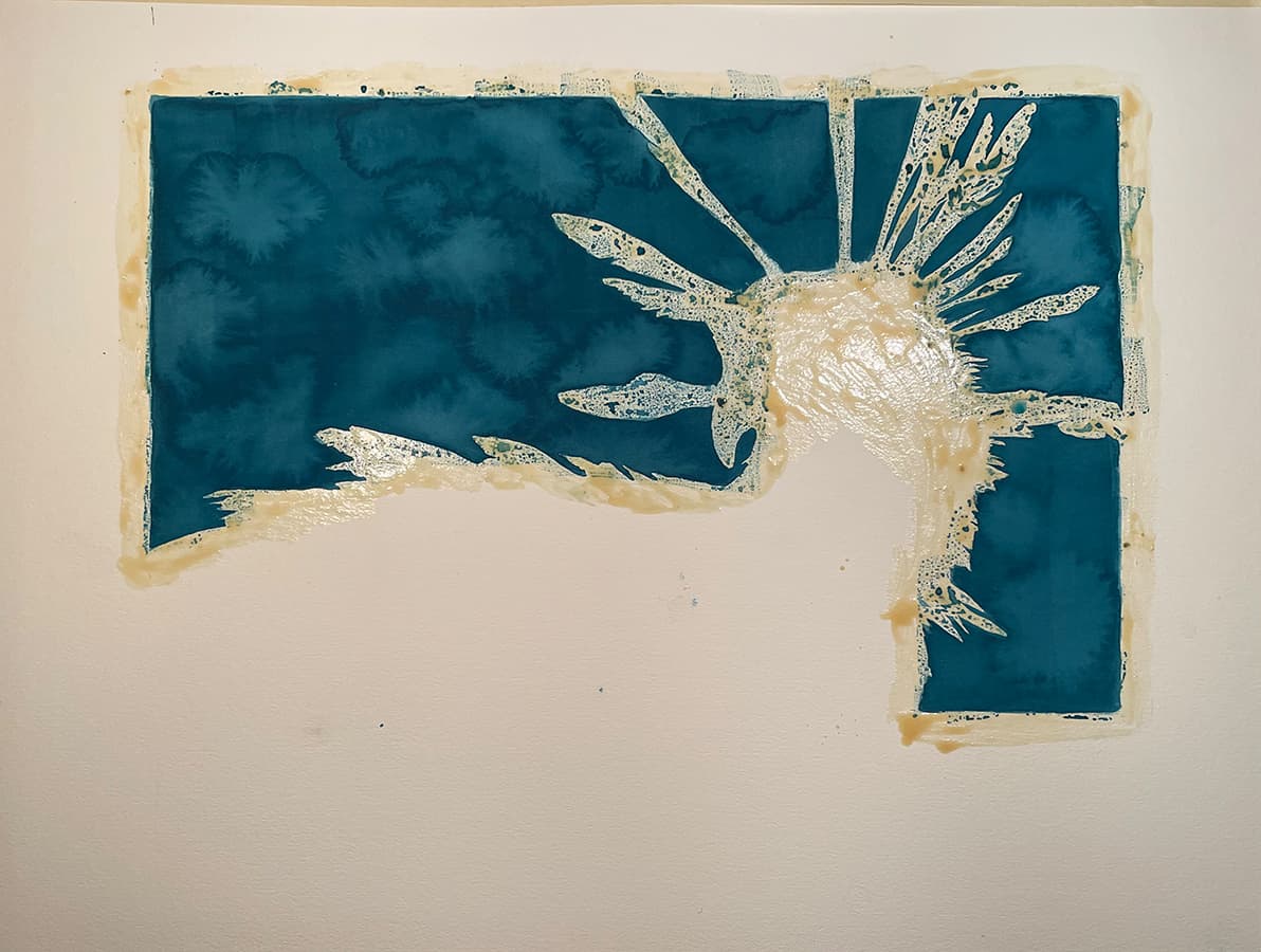
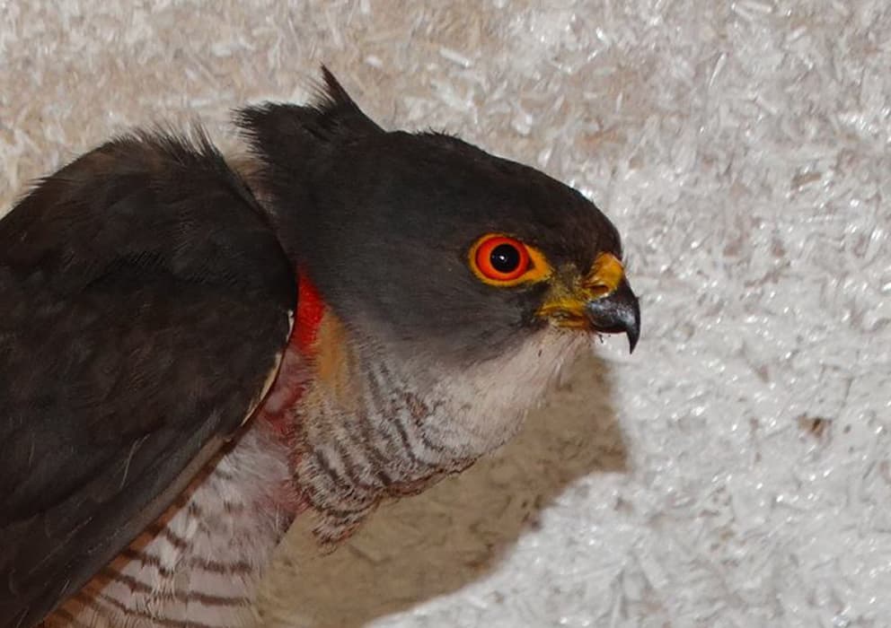
I have never seen a Little Sparrowhawk, but I knew of them and wanted to paint them, especially when I found what I thought was a photo of a Little Sparrowhawk on and old Facebook page – the Naivasha Owl Centre, run by my Friends, Shiv Kapila and Simon Thompsett . My buddies now operate the Kenya Bird of Prey Trust, and actually saved the day halfway through the painting by showing me images of a recent rescue, which was the right species. The original image I was working froim turned out to be a Shrika, a close relative, with Red Eyes, much like the Northern Goshhawk from the USA and Canada.

I trawled the Web for images of a Little Sparrowhawk in flight, and found this inspirational photo by Luciano Piazza on his instagram.
Stupidly, I ignored that this Sparrowhawk clearly had deep golden, and not red eyes!

I composited the images of Hero and Luciano's Sparrowhawk, in Photoshop, and added in and edited a branch. In hindsight, I think the positioning of Hero's head was a little awkward, and changing the feet so they were grasping the branch instead of being about to alight, as in the original photo, was not successful either.

Before beginning the painting, I first lay out a few swatch tests, on a pad of Arches 140 lb cold press, settling on a wet-on-wet blend of Chromium Yellow Deep and Yellow Ochre.

I lay in clear water up to the outline of the subject leaving a dry silhouette, then quickly wash in a light layer of chromium yellow deep, blending more yellow ochre at the top.
Then I add and work in a little some clear water to create teh deliberate blooms that identify my background panel style.

I had used an image from Kenya Bird of Trust's old facebook page – the Naivasha Owl Centre: https://www.facebook.com/naivashaowls/, of a rescue called 'Hero", which, as it turned out was not a Little Sparrowhawk, but a Shrika. Shrikas are close cousins, but, critically, their eyes are red/orange eyes instead of the deep gold/yellow of the Little Sparrowhawk.
Ultimately this mistake came back to bite me, requiring gouache over-painting, which as a watercolorist, is a technique I typically despise! It was a shame, as the eye came out pretty well. I laid in a wet-on-wet wash of the head and throat areas before painting the eye, leaving reflections as mostly paper color, soften with subtle over-glaze. Colors are Pyrol red and alazarin Crimson. Pupil is Payne's Grey, Prussian Blue and Burnt Umber – not black!
"Hero" the rescue Shrika, who sadly, died shortly after being rescued.

Using a combination of wet-on-wet and wet-on-dry, i start laying in the barred patterns of the leading primary feathers and start to loosely define the russet flank, with its beautiful barring patterns.
I paint the topmost feathers first, and wait for each feather to be dry before painting the one underneath. This way, if I want to paint shadows directly into the wet-on-wet underlying feather while it is still damp, preventing the shadow from bleeding to the feathers above. In this instance I patterned the feathers first and over-glazed shadows in a later step. Not yet settled on a preferred technique!

Secondary feathers are typically held closer together than the primaries and are less pointed. They are responsible for most of the lift a bird gains from flapping, hence their curved profile, while primaries add some lift but are mostly critical for guidance. Raptors have amazing muscle control of their primaries, allowing them to tilt and readjust as they dive or hover.
I complete the primaries and add in the secondaries at the lower outside of the wing, and add to the flank and throat areas.

Coverts are softer feathers, adding dimension for lift and strength to support the primaries and secondaries. They occur in multiple layers. I lay in the base for the inner coverts, paying attention to not only the patterning, but also laying in softly bled shadows to create dimension. Then I laid in a loose wet treatment of the rear wing.
A diagram of the wing parts of a bird, from Avian Report:


I glaze and over-paint details and shadows to build up the dimension of the rear wing, softening each glaze area with water to avoid high contrasts.

After discovering that the reference photo I had used for the head area was actually from a Shrika, i reached out to Simon Thompsett, of the Kenya Bird of Prey Trust who provided me with photos of an actual Little Sparrowhawk, named Sax, which had been recently rescued. I then, in an agony of guilt and feeling every bit like a forger, over-painted the eye in gouache. Little Sparrowhawks are also differentiated by having longer middle toes, so I had to use gouache and even a layer of white acrylic to fix that portion.
I preferred the "pure" watercolor red eye, but accuracy prevails in ornothological paintings.

A photo of "Mini" a Little Sparrowhawk, that was rescued last year, by Kenya Bird of Prey Trust.

After correcting the eye, and glazing for a bit more shadowing and depth of tone, all that is left is the moss covered log.

I painted the mossy log, wet-on-wet with a lot of glazing for detail, in Van Dyke Brown and Burnt Umber, darkened in places with Payne's Grey and Prussian Blue.
Ultimately I was not entirely satisfied with this piece, with its slightly awkward pose and gouache and acrylic over-painting "fixes".